KOMBINÄSCH Verlag
Bachelor-Projekt | 2013
Im Rahmen meines Bachelor-Projektes habe ich einen fiktiven Verlag gegründet, der Musik & Bildende Kunst in einem Release vereint. Neuauflagen von Schallplatten werden dabei mit einem Magazin kombiniert, das Informationen über die Band, ein Interview, Songtexte und freie Interpretationen der Songs von unterschiedlichen Künstlern enthält.
Den Arbeitsprozess habe ich auf kombinaesch.tumblr.com dokumentiert.
--
For my bachelor-thesis i decided to create a fictional label that combines music and visual arts into a single release. Reiusses of vinyl are being combined with a magazine that holds information on the band, an interview, the lyrics and free interpretations of the songs by different artists.
A work-in-progress documentation of the project can be seen at: kombinaesch.tumblr.com
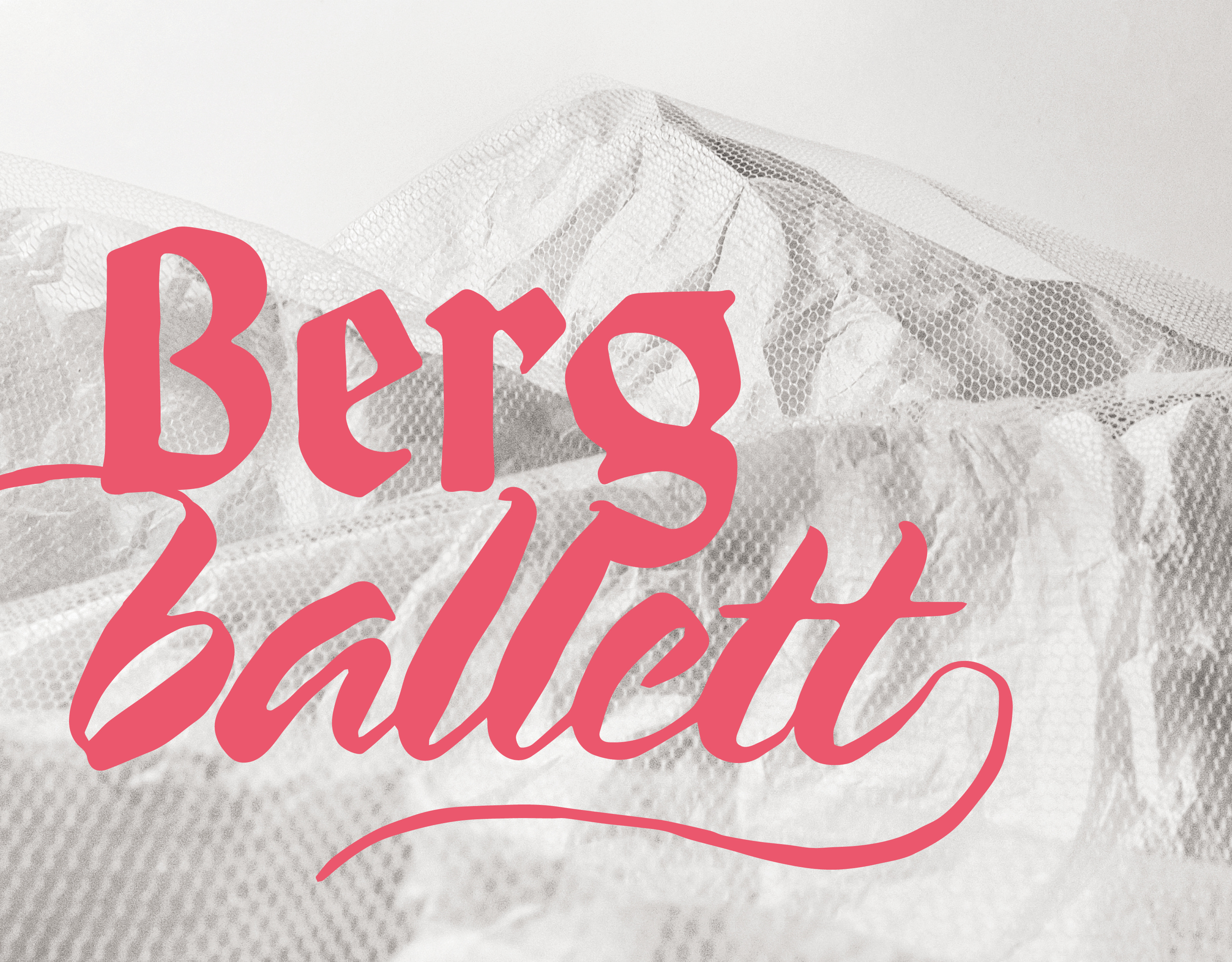
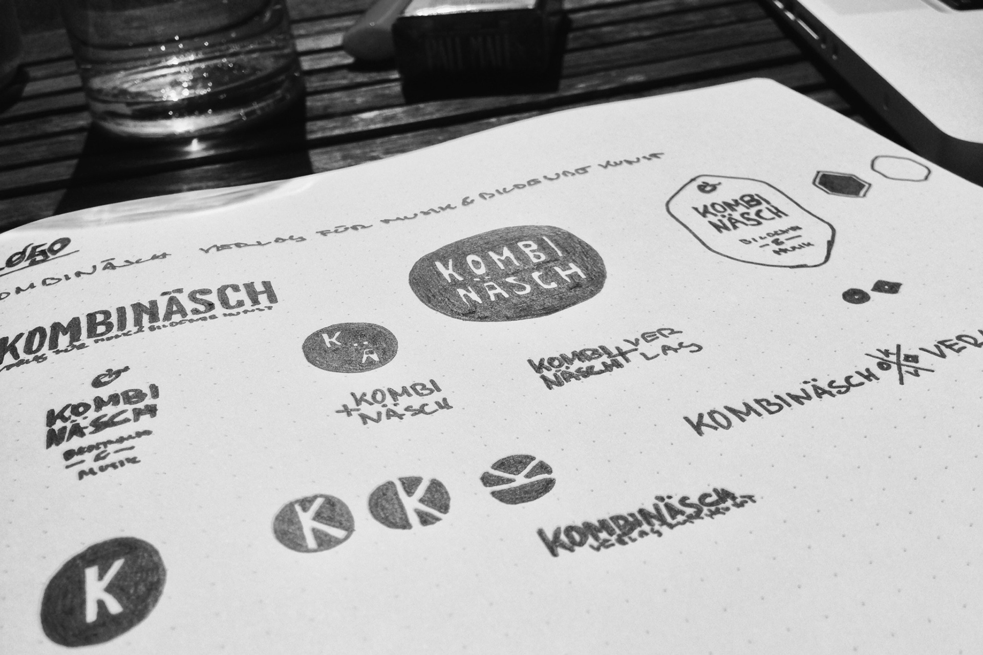
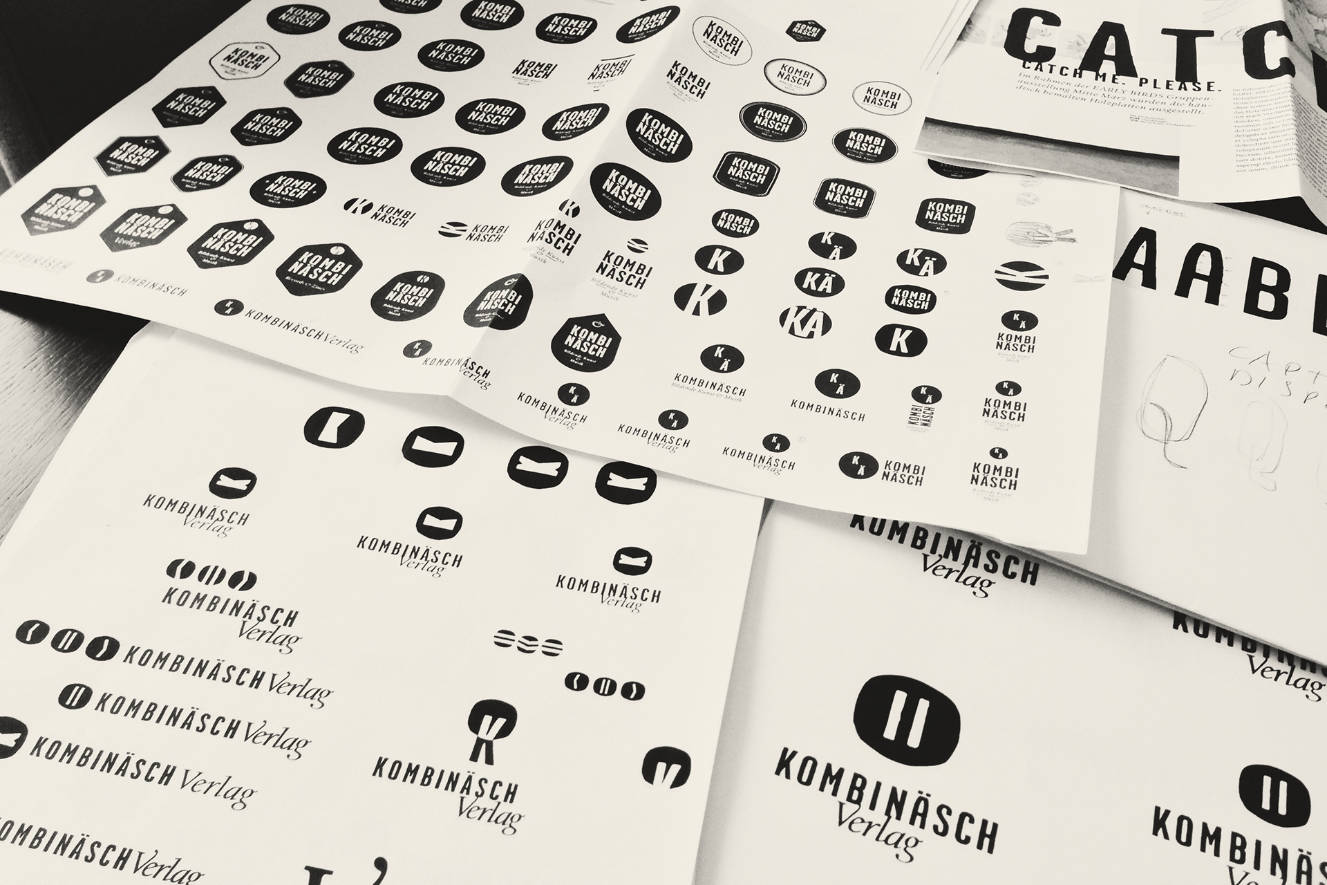
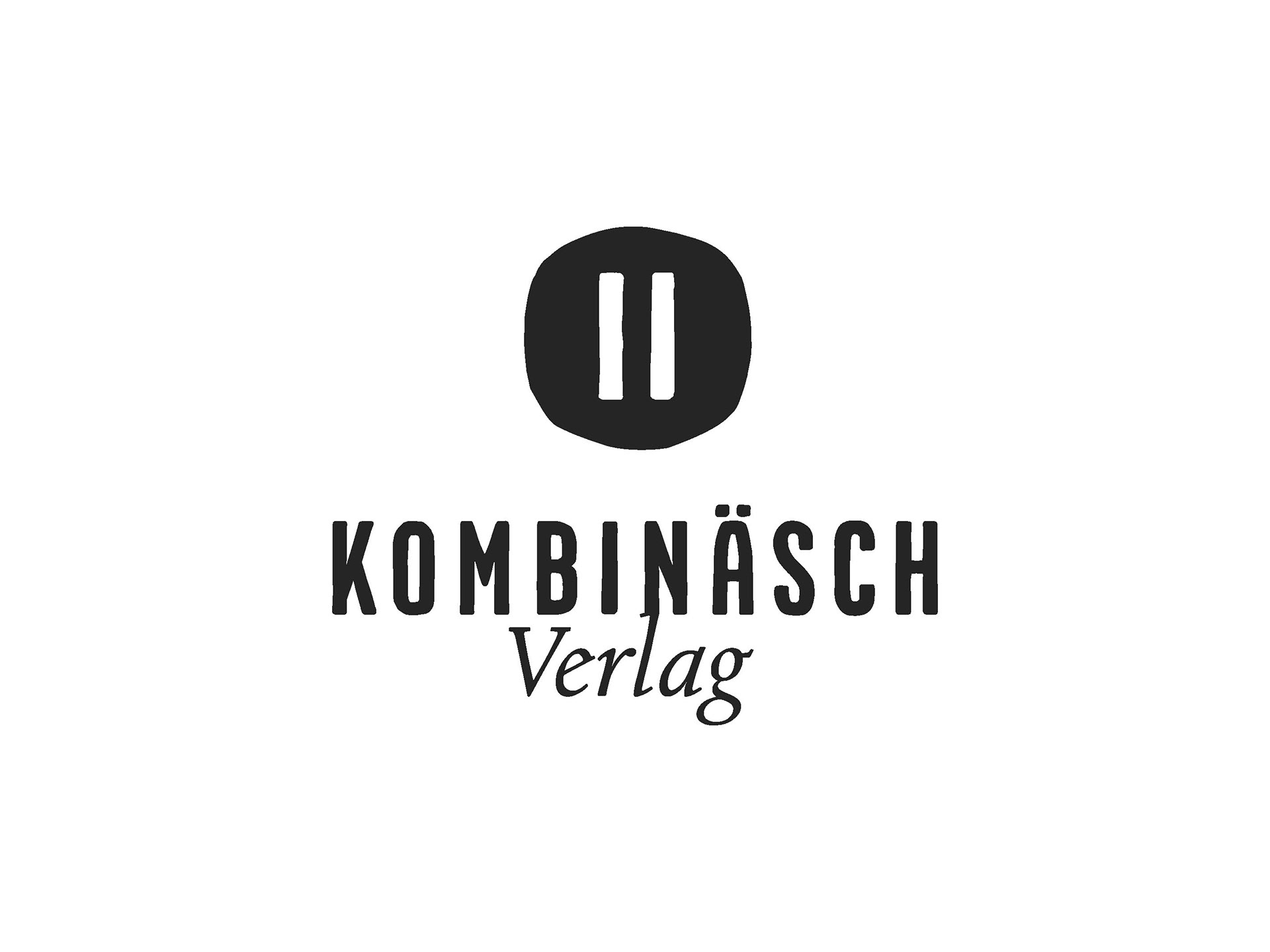
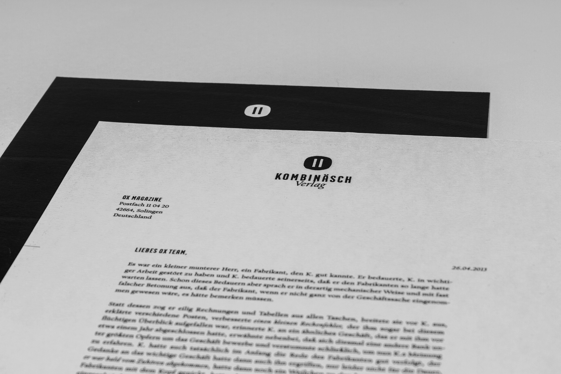
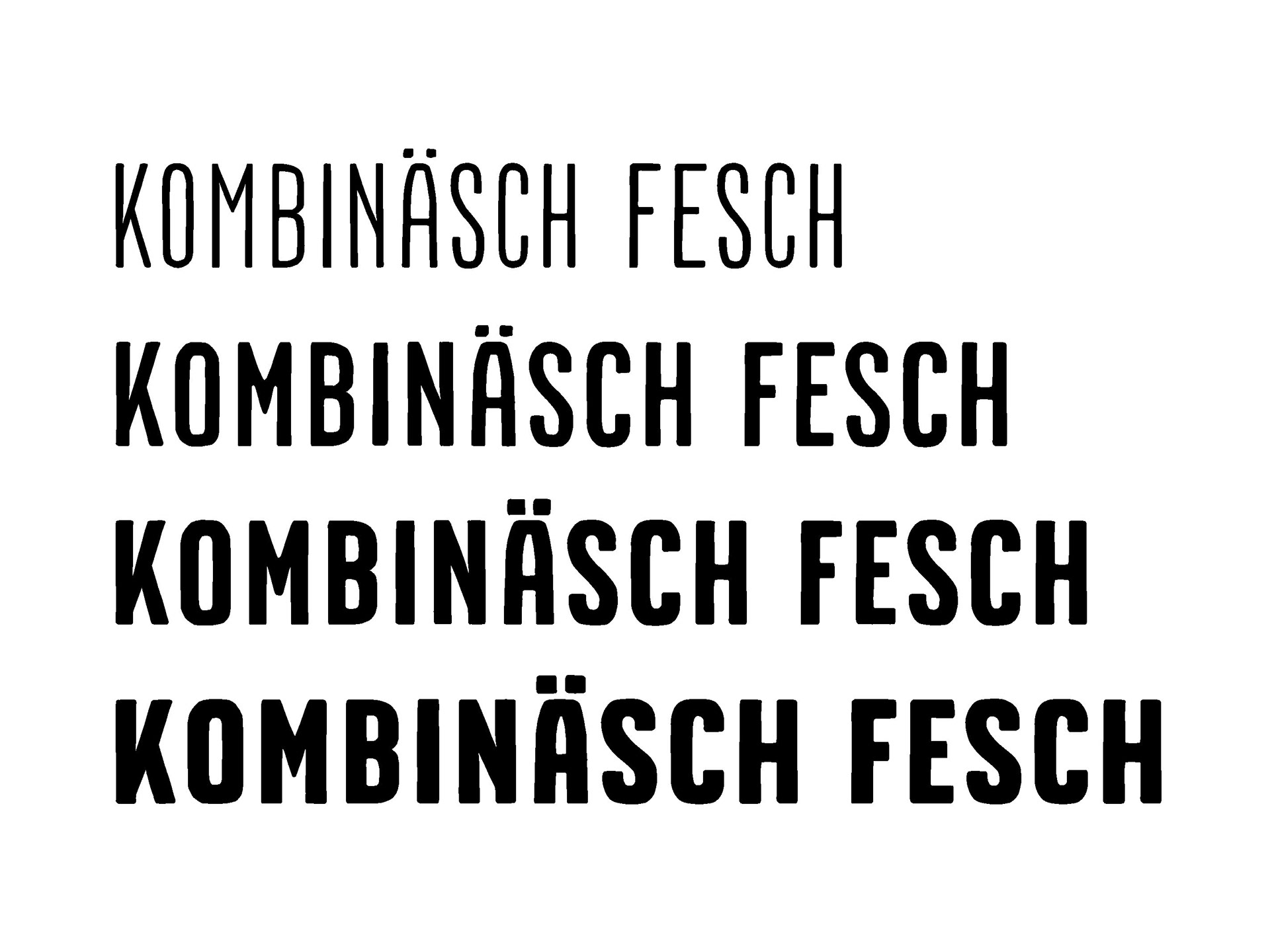
Der Verlag hat seinen Sitz in Wien und verbindet Musik und bildende Kunst. Beides sollte sich auch in Namen und Logo wieder spiegeln. Der Wiener Ausdruck Kombinäsch leitet sich von der französischen Combinaige ab. Einer Kombinationsunterwäsche für ältere Damen. Das Icon zeigt zwei Elemente – Musik und bildende Kunst, Vinyl und Magazin – in einem schallplattenförmigen Kreis vereint. Auch bei der Schriftwahl wurde eine kontraststarke Kombination gewählt. Zusätzlich zur eigens gezeichneten Kombinäsch Fesch wurde Frederic Goudy's Californian Text verwendet.
--
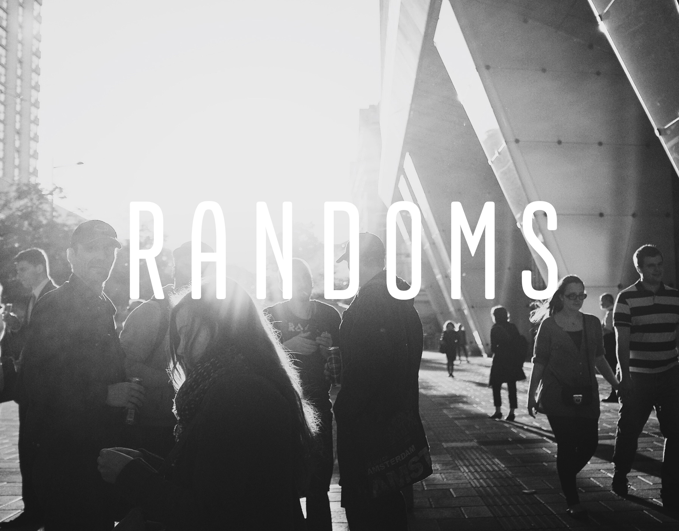
THE LABEL
The Label resides in Vienna, Austria and combines music with visual arts. Both should be reflected in the Name and Logo. The viennese word Kombinäsch is derived from the french Combinaige, a combined underwear for elderly women. The icon shows the two elements–music and visual arts, vinyl and magazine–combined in a circle, reminding of the vinyl itself. The fonts were selected to create a strong contrast. Frederic Goudy's Californian Text was combined with the labels own typeface Kombinäsch Fesch.
--
THE LABEL
The Label resides in Vienna, Austria and combines music with visual arts. Both should be reflected in the Name and Logo. The viennese word Kombinäsch is derived from the french Combinaige, a combined underwear for elderly women. The icon shows the two elements–music and visual arts, vinyl and magazine–combined in a circle, reminding of the vinyl itself. The fonts were selected to create a strong contrast. Frederic Goudy's Californian Text was combined with the labels own typeface Kombinäsch Fesch.
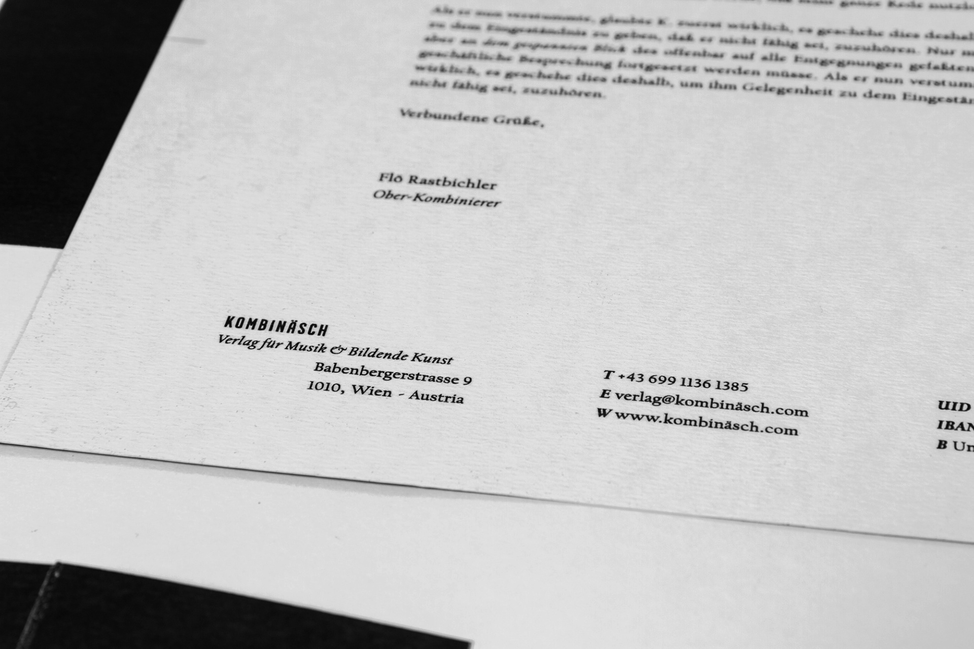
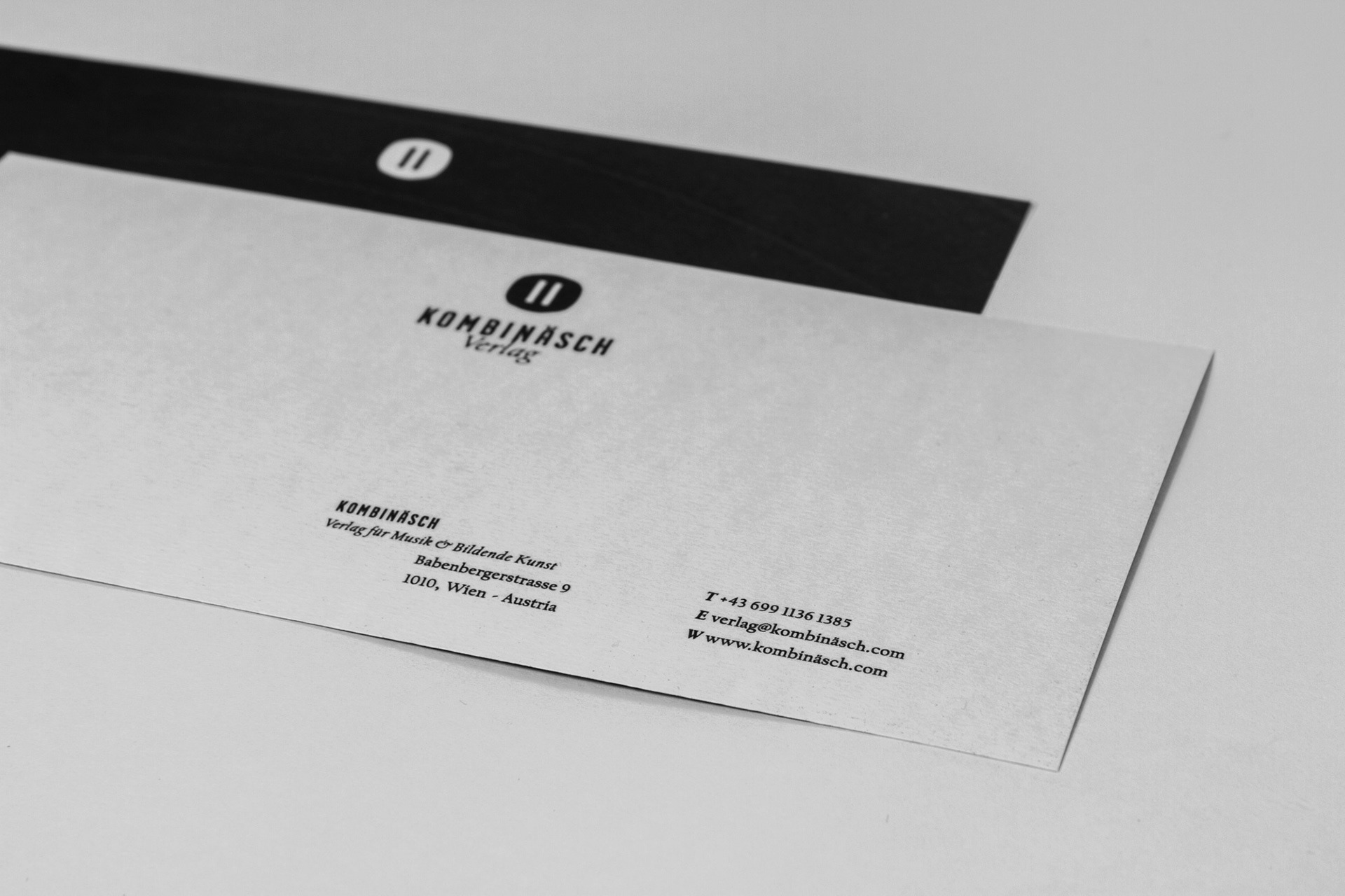
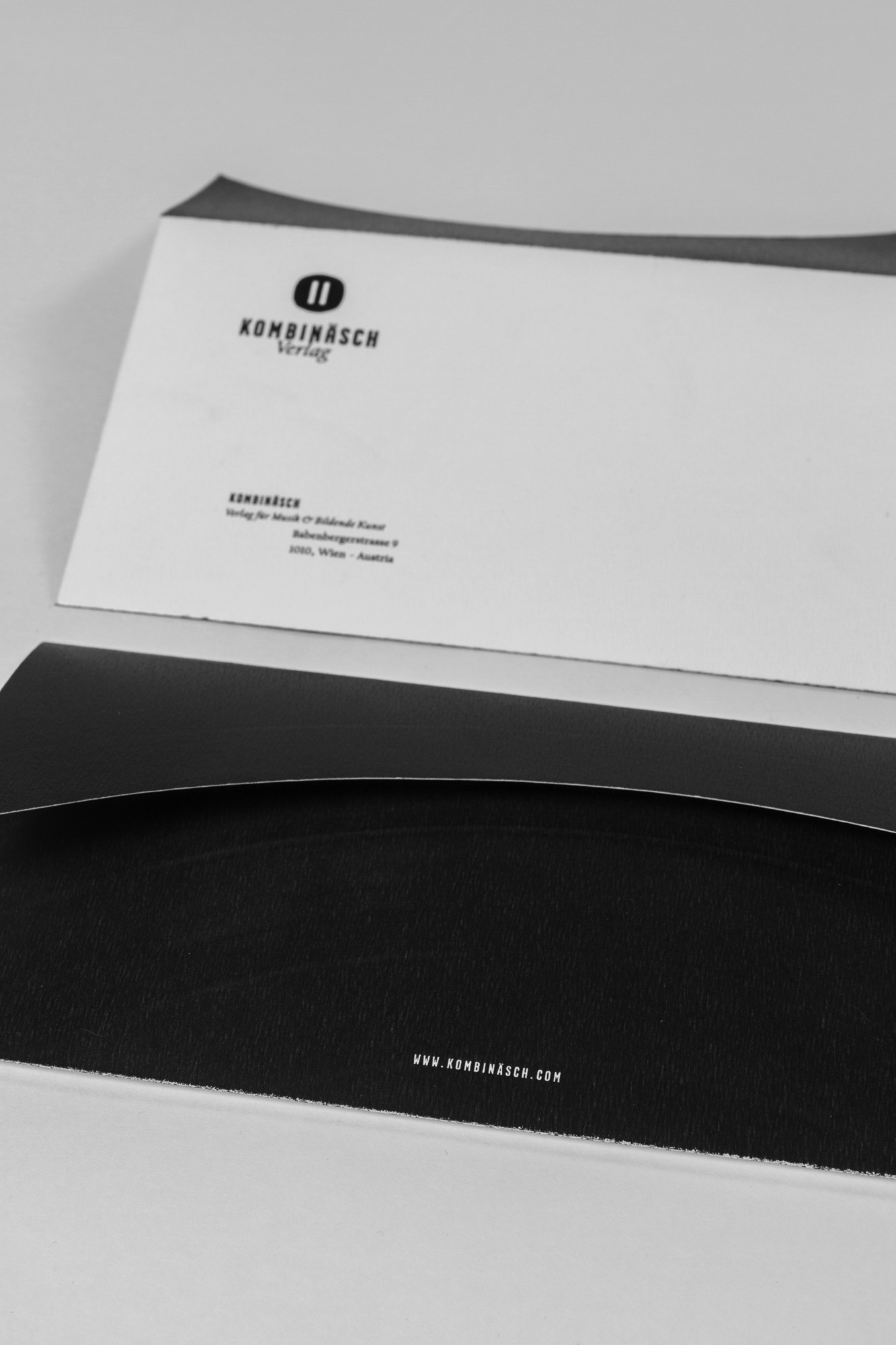
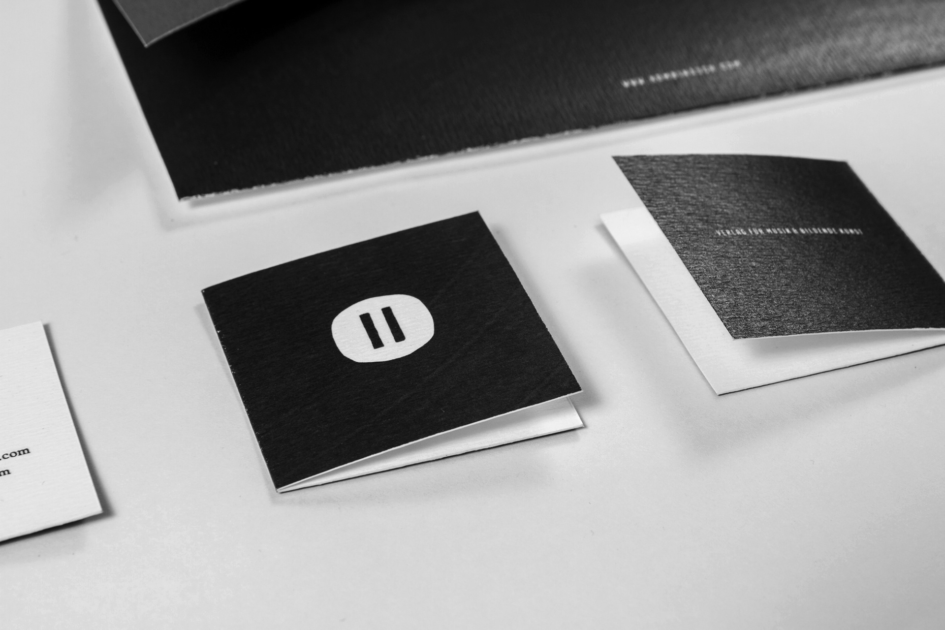
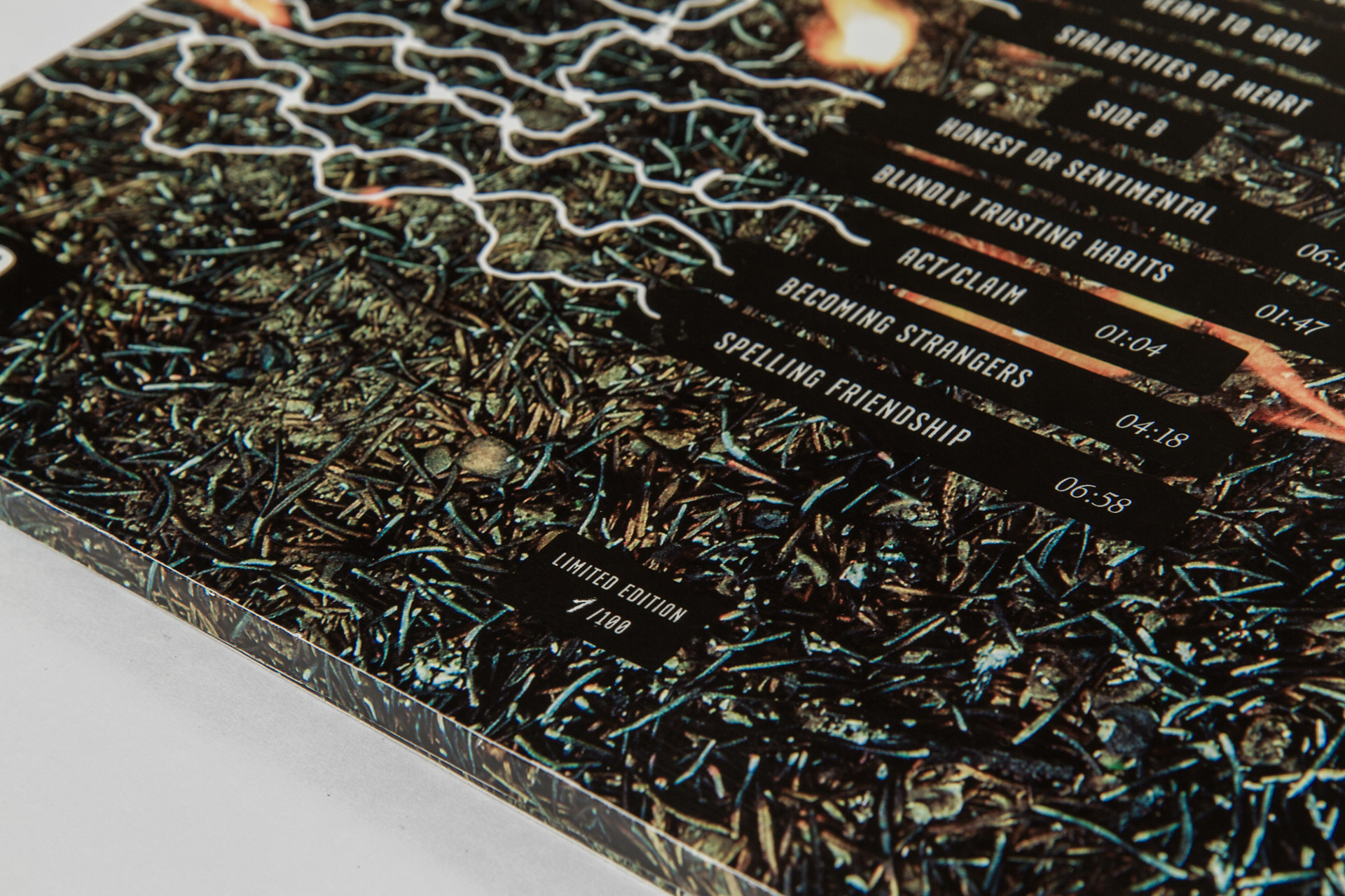
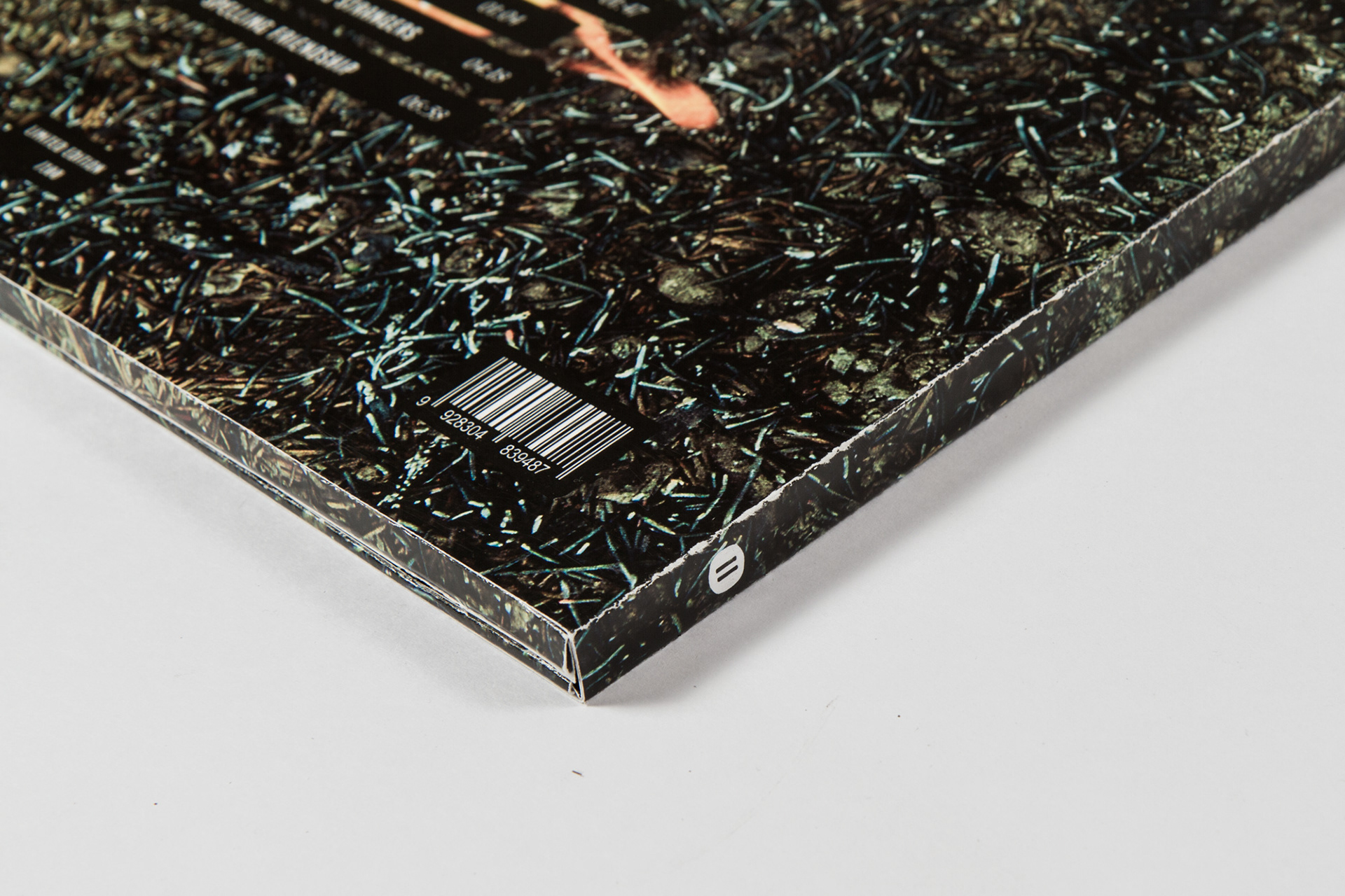
Die Geschäftsausstattung des Verlages wurde bewusst sehr reduziert angelegt um zu den unterschiedlichen Optiken der verschiedenen Releases zu passen. Für die Rückseiten wurde eine Schallplatte hochauflösend gescannt um den Bezug zur Musik zu verdeutlichen. Gedruckt wurde auf dem haptisch sehr griffigenTradition von Rives, ein Bezug auf das handwerkliche der bildenden Kunst.
--
--
BUSINESS PAPERS
The business papers of the label were kept simple to fit the different styles of the releases. Black vinyl was scanned in a very high resolution and printed on the backsides to create a visual reference to music.
To reference the physicality of the visual arts, everything was printed on Tradition by Rives.


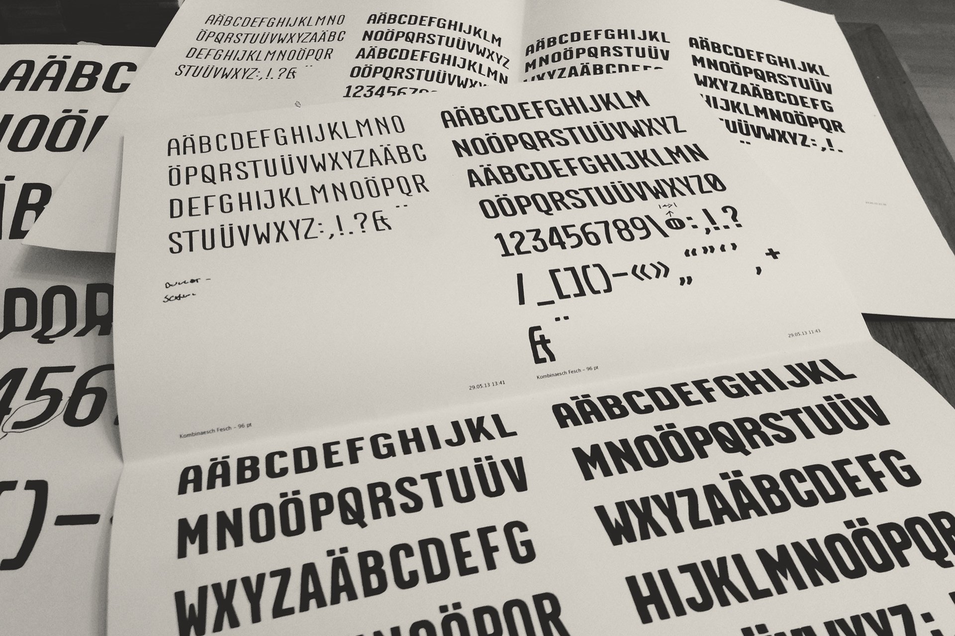
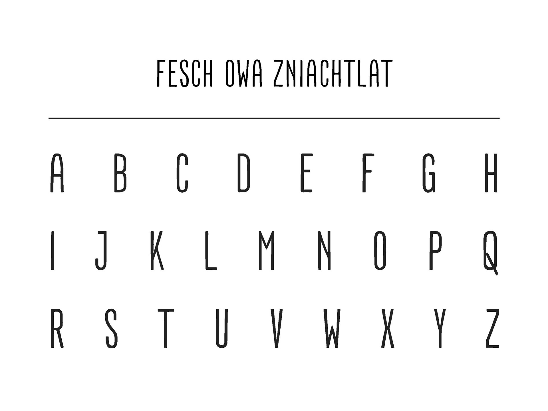
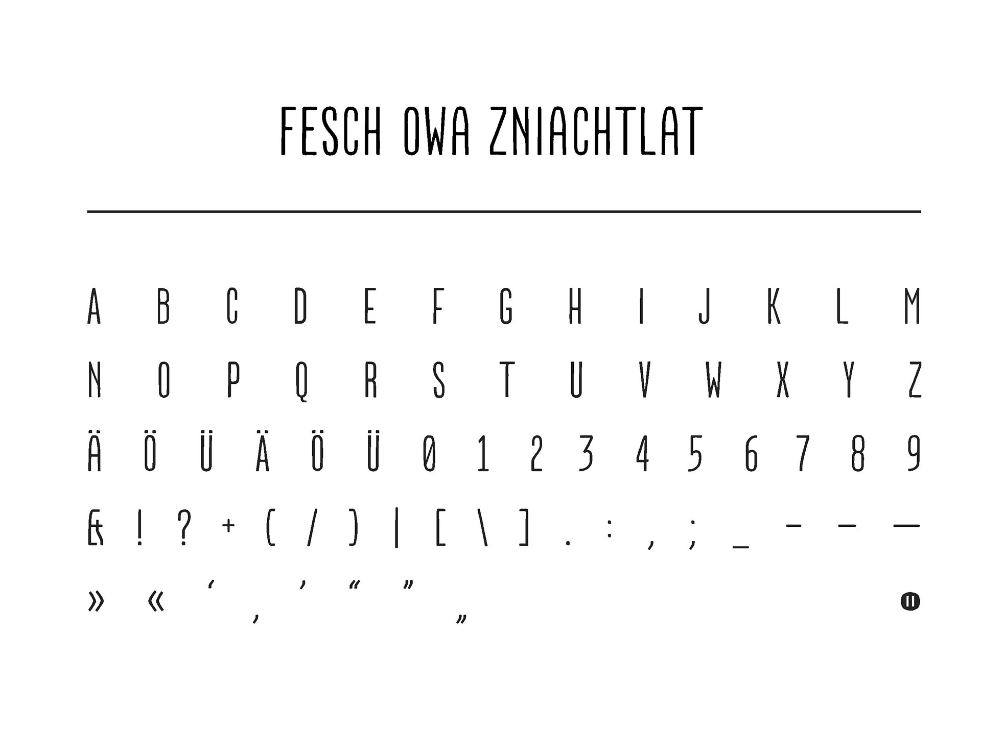
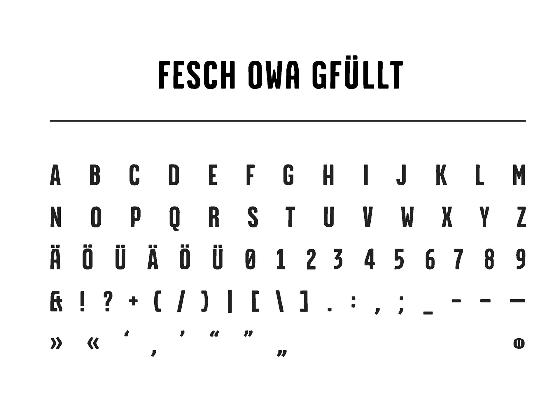
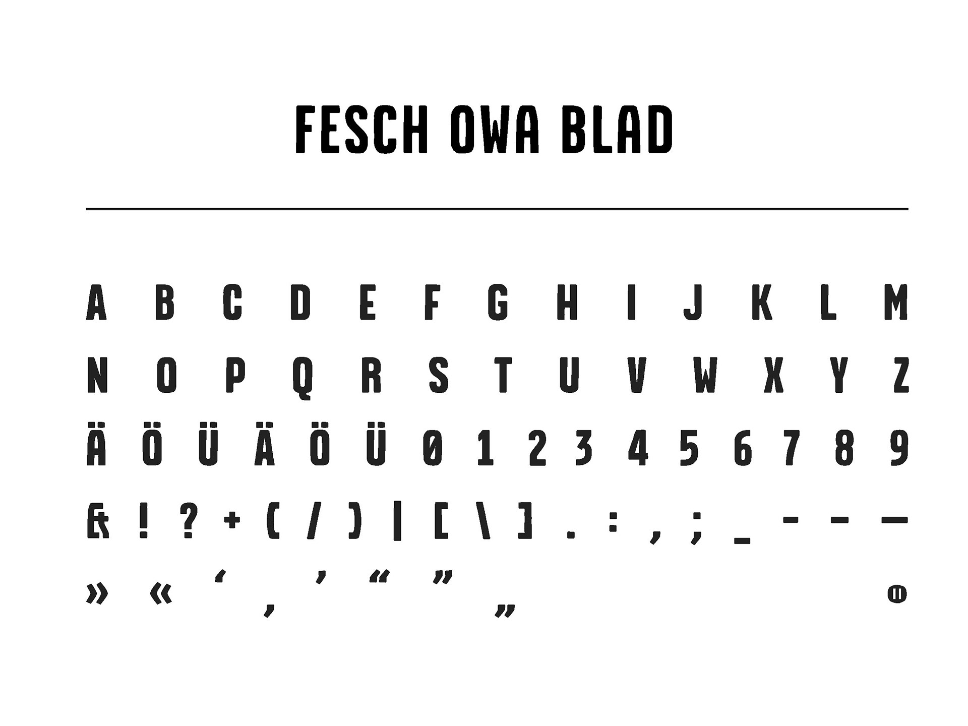
Die für den Verlag entstandene Schrift "Kombinäsch Fesch" wurde in vier Schnitten händisch gezeichnet.
Passend zum Thema Musik wurden die händischen Zeichnungen mit Lackstift angefertigt und anschließend digital verfeinert. Aufgrund des Projektumfangs wurden nur die benötigten Glyphen gezeichnet.
Passend zum Thema Musik wurden die händischen Zeichnungen mit Lackstift angefertigt und anschließend digital verfeinert. Aufgrund des Projektumfangs wurden nur die benötigten Glyphen gezeichnet.
--
THE FONT
All four weights of the "Kombinäsch Fesch" typeface have been drawn by hand. The original drawings were made with a marker, fitting the music-theme of the project, and were then refined digitally. Only the glyphs needed for the project were drawn due to the extent of the project.
THE FONT
All four weights of the "Kombinäsch Fesch" typeface have been drawn by hand. The original drawings were made with a marker, fitting the music-theme of the project, and were then refined digitally. Only the glyphs needed for the project were drawn due to the extent of the project.


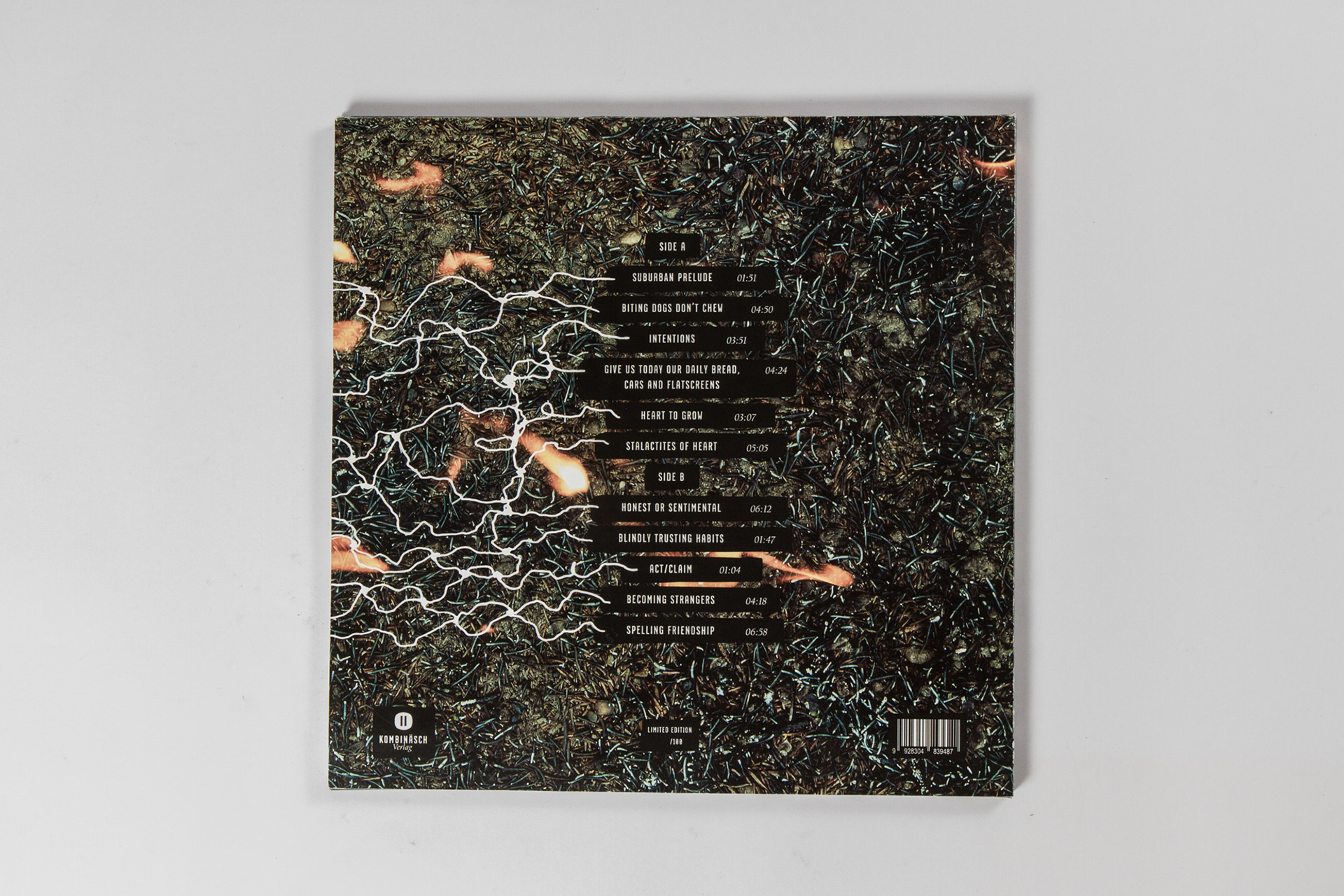
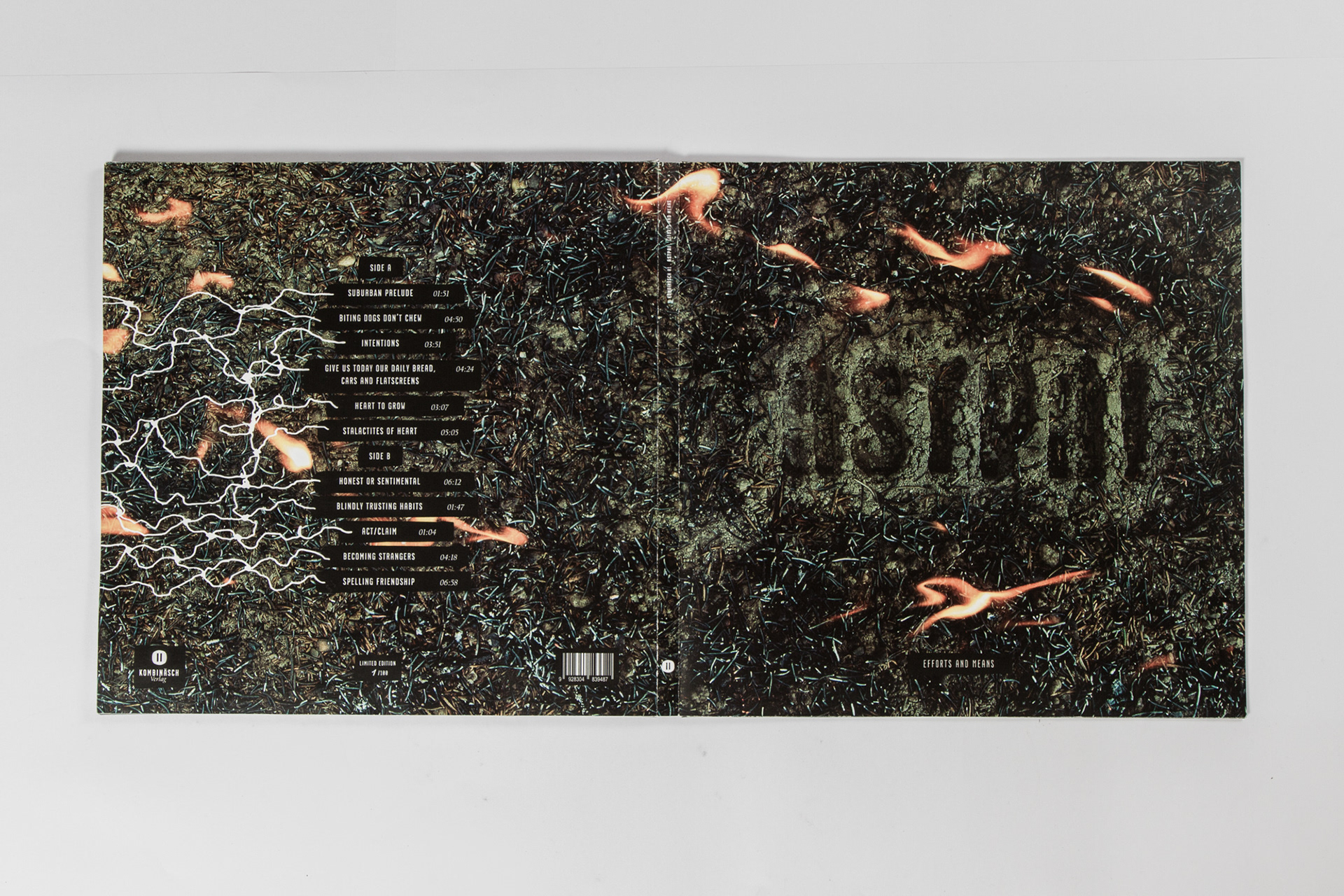
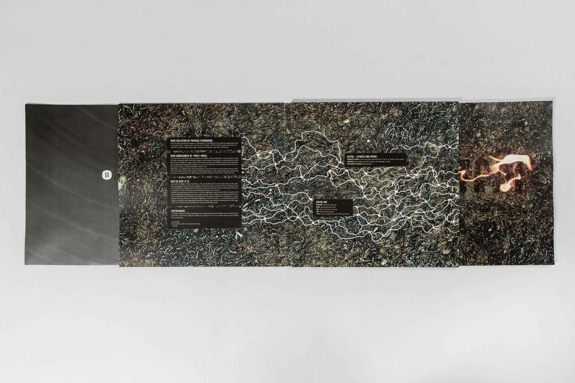
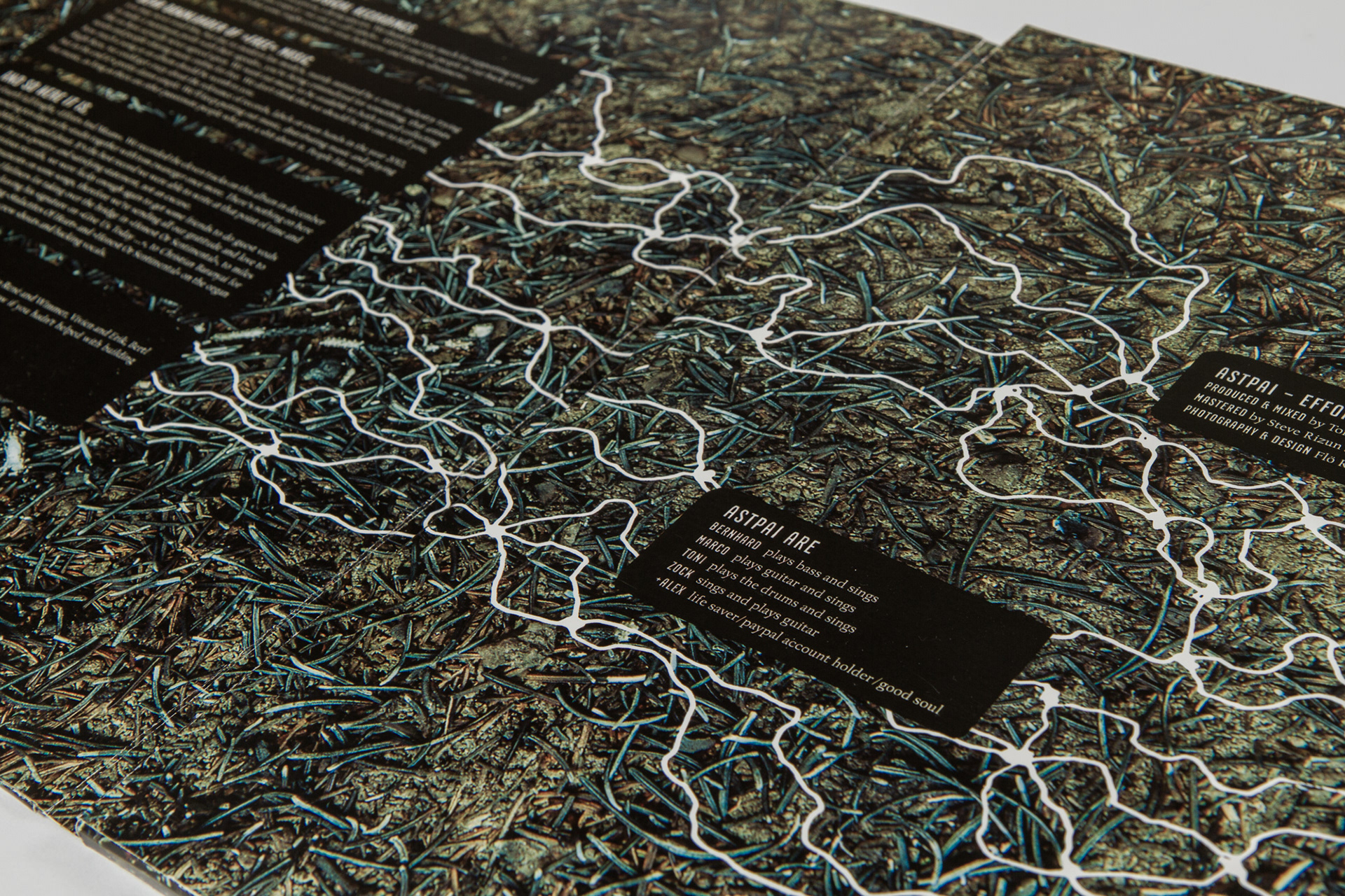


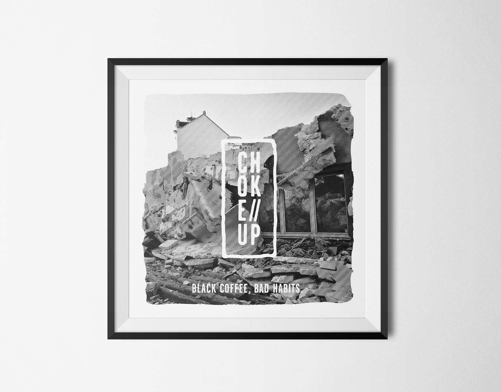
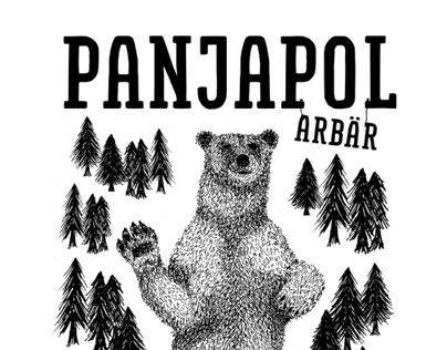
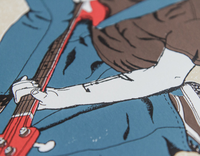
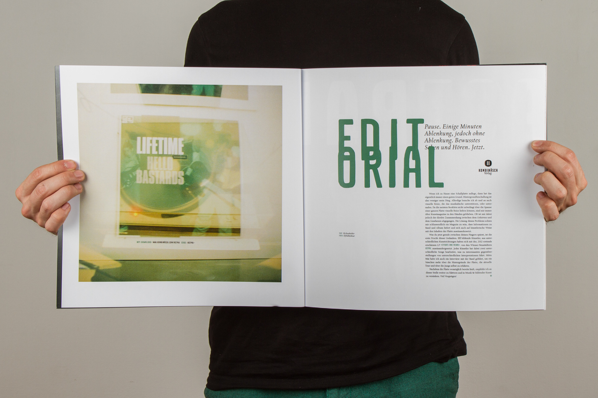
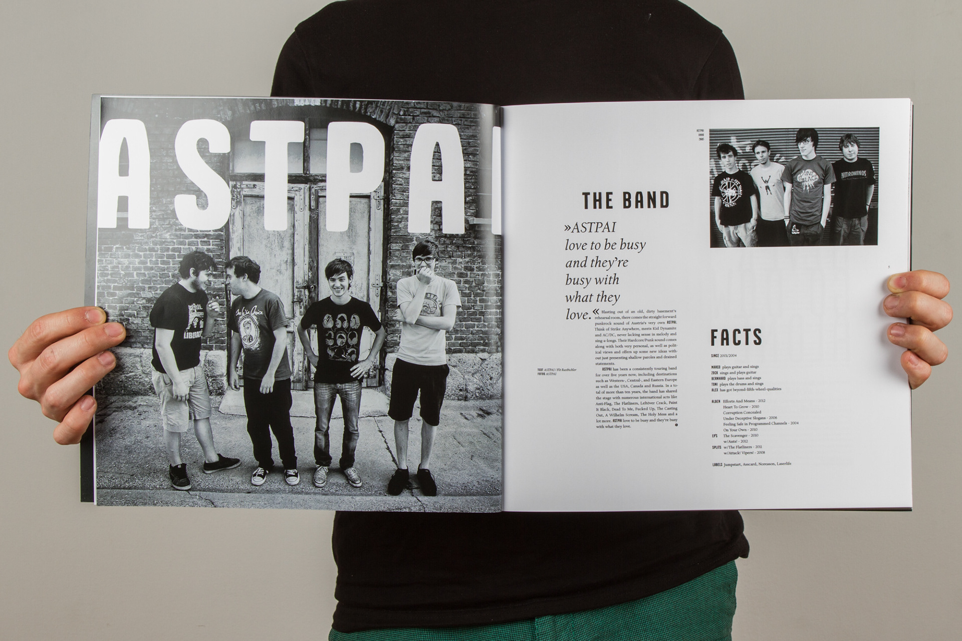
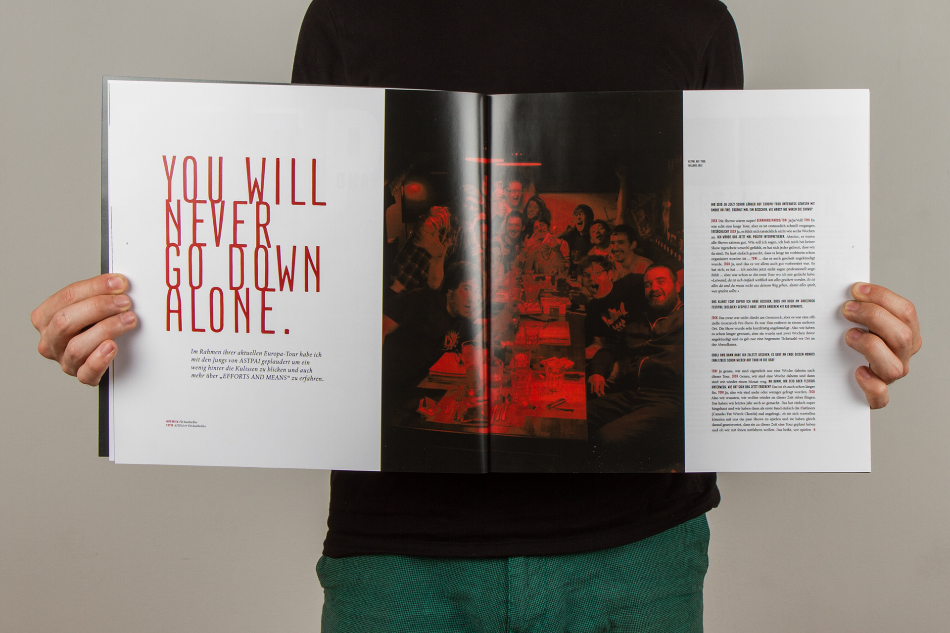
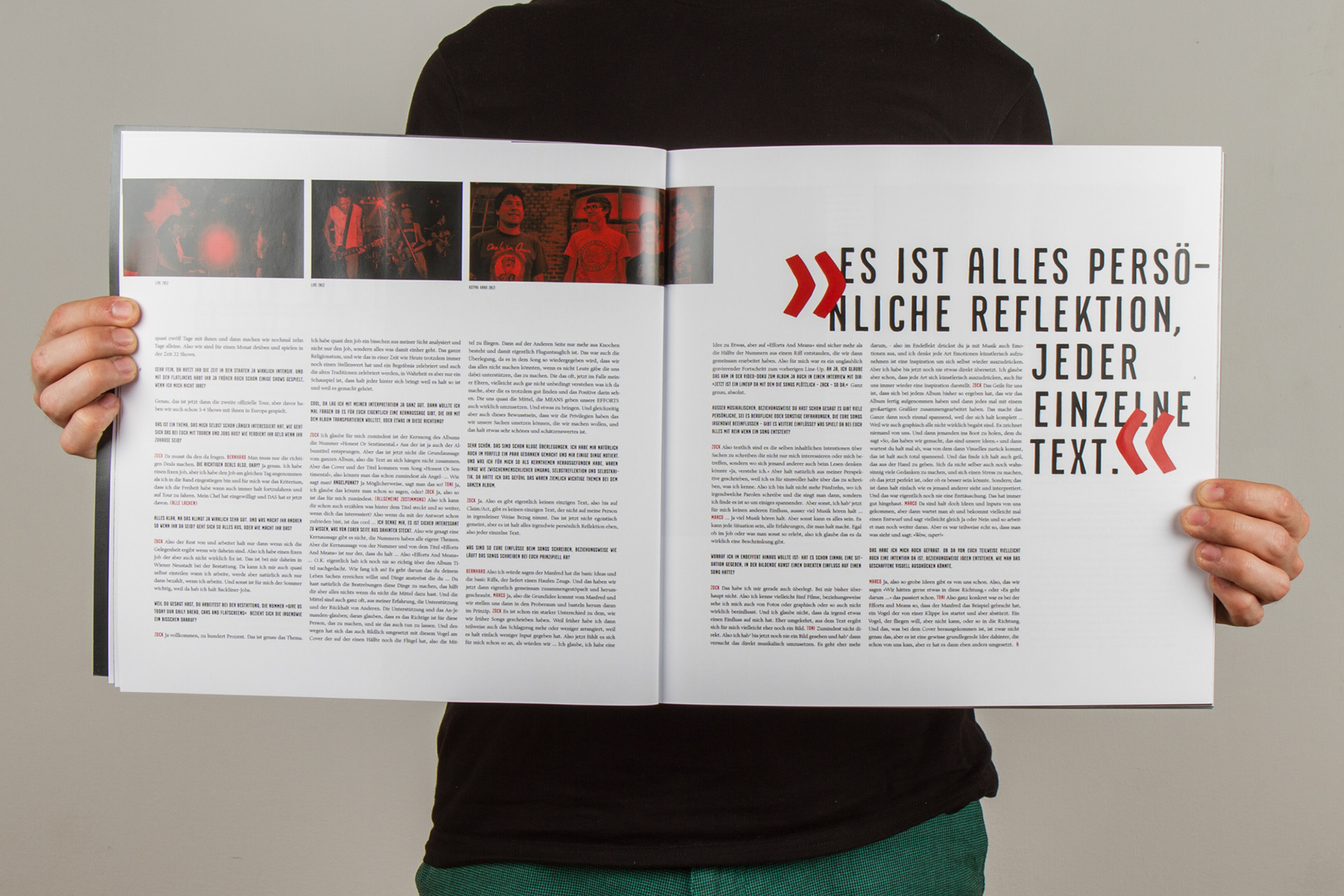
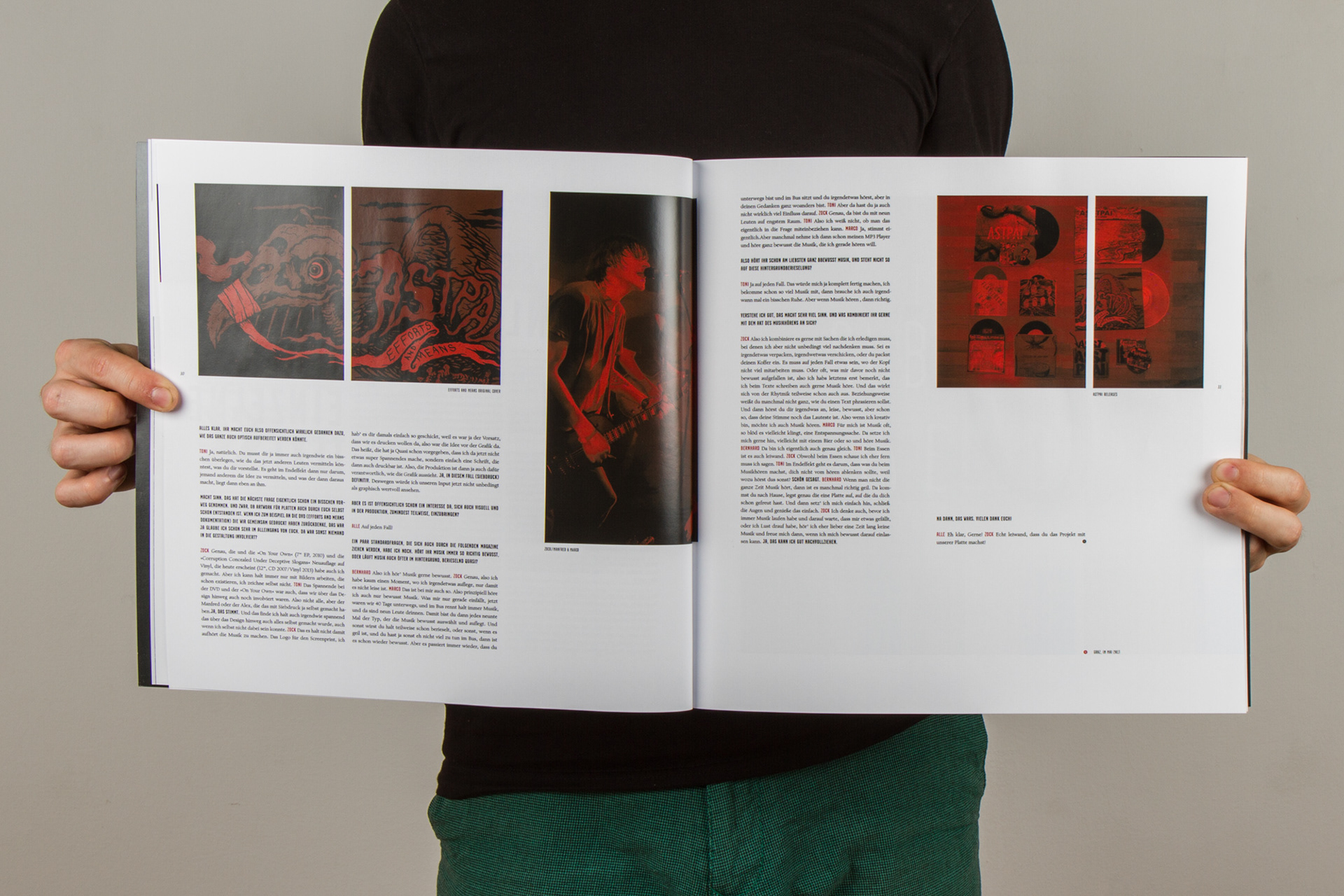
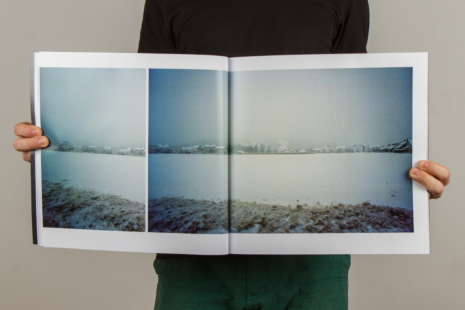
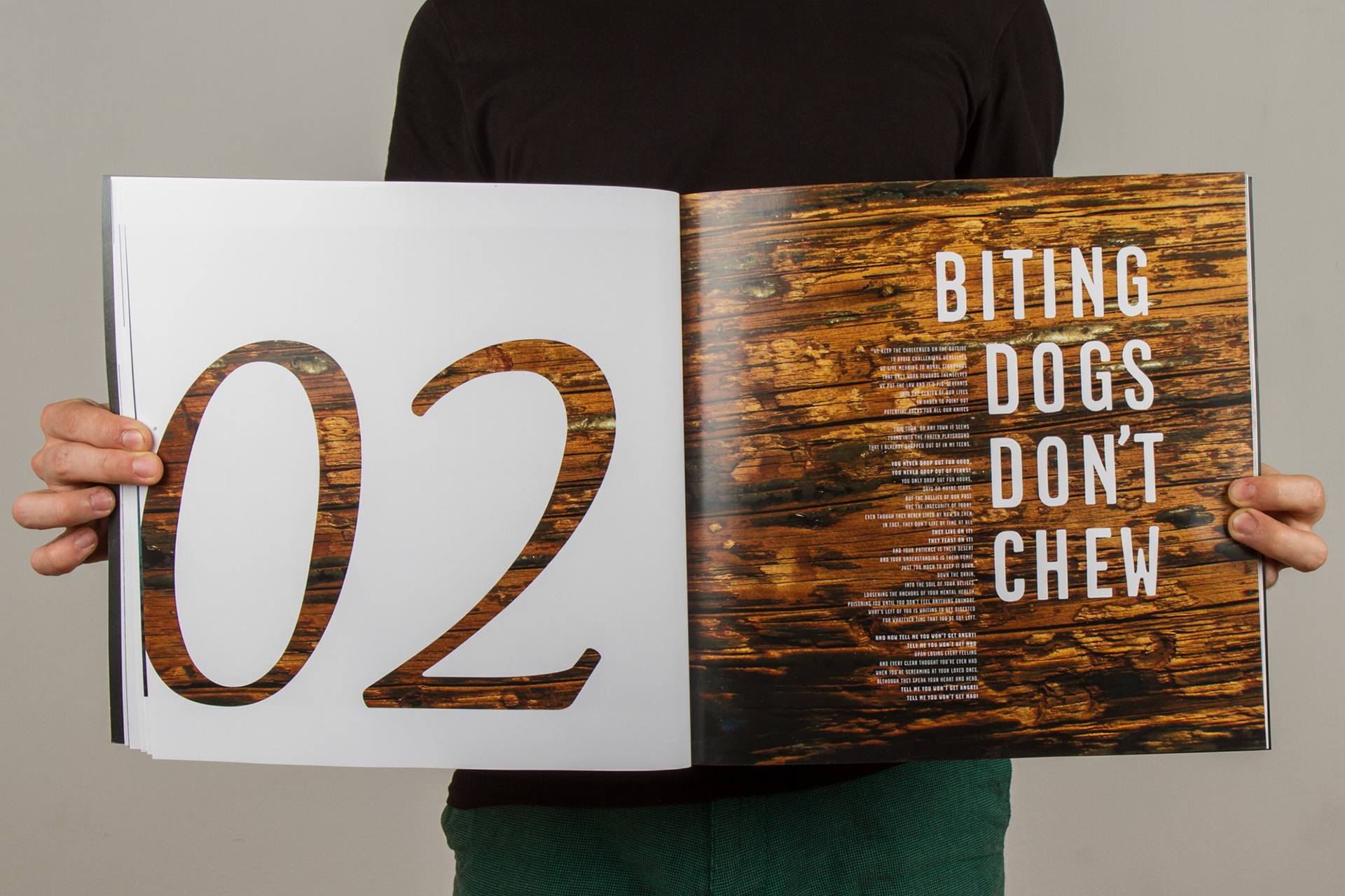
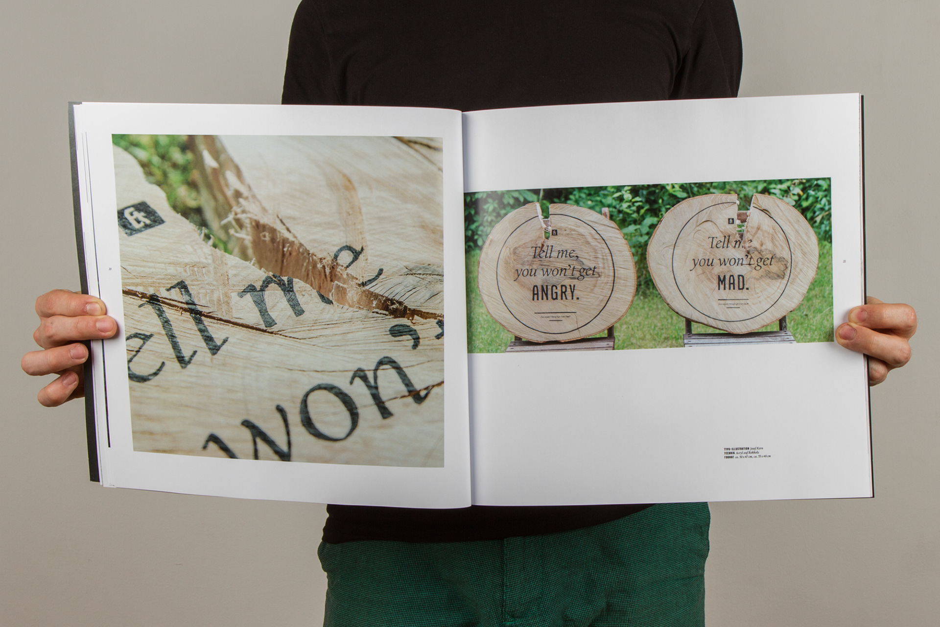
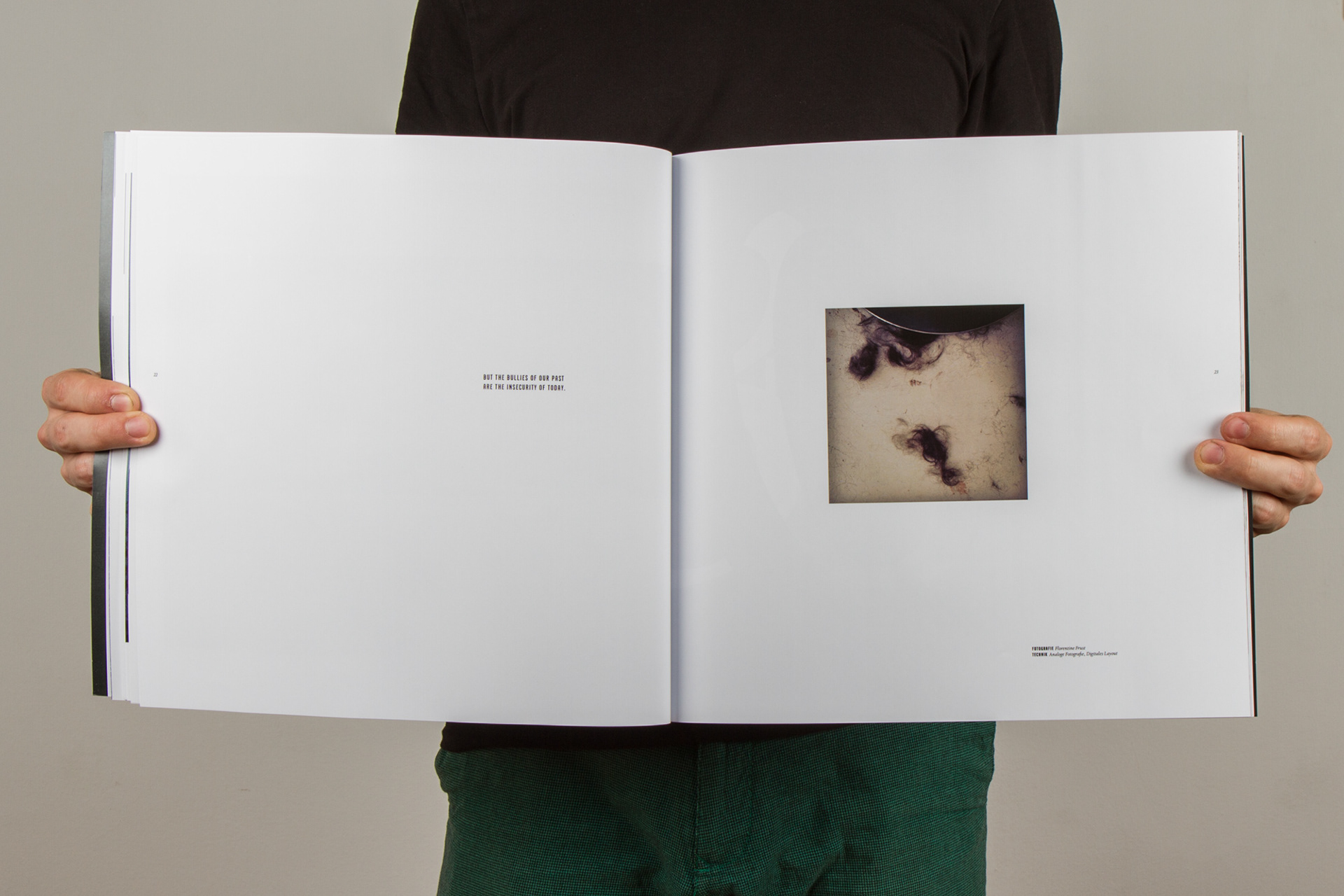
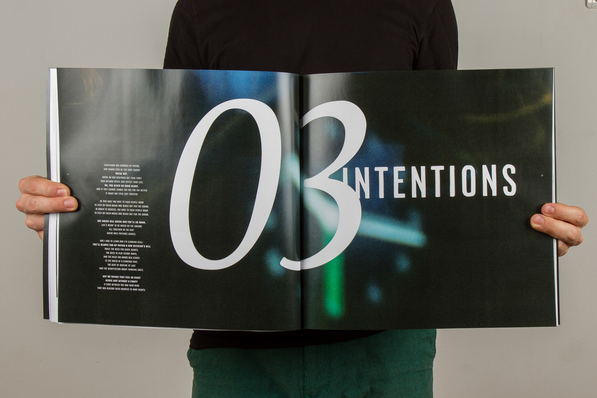
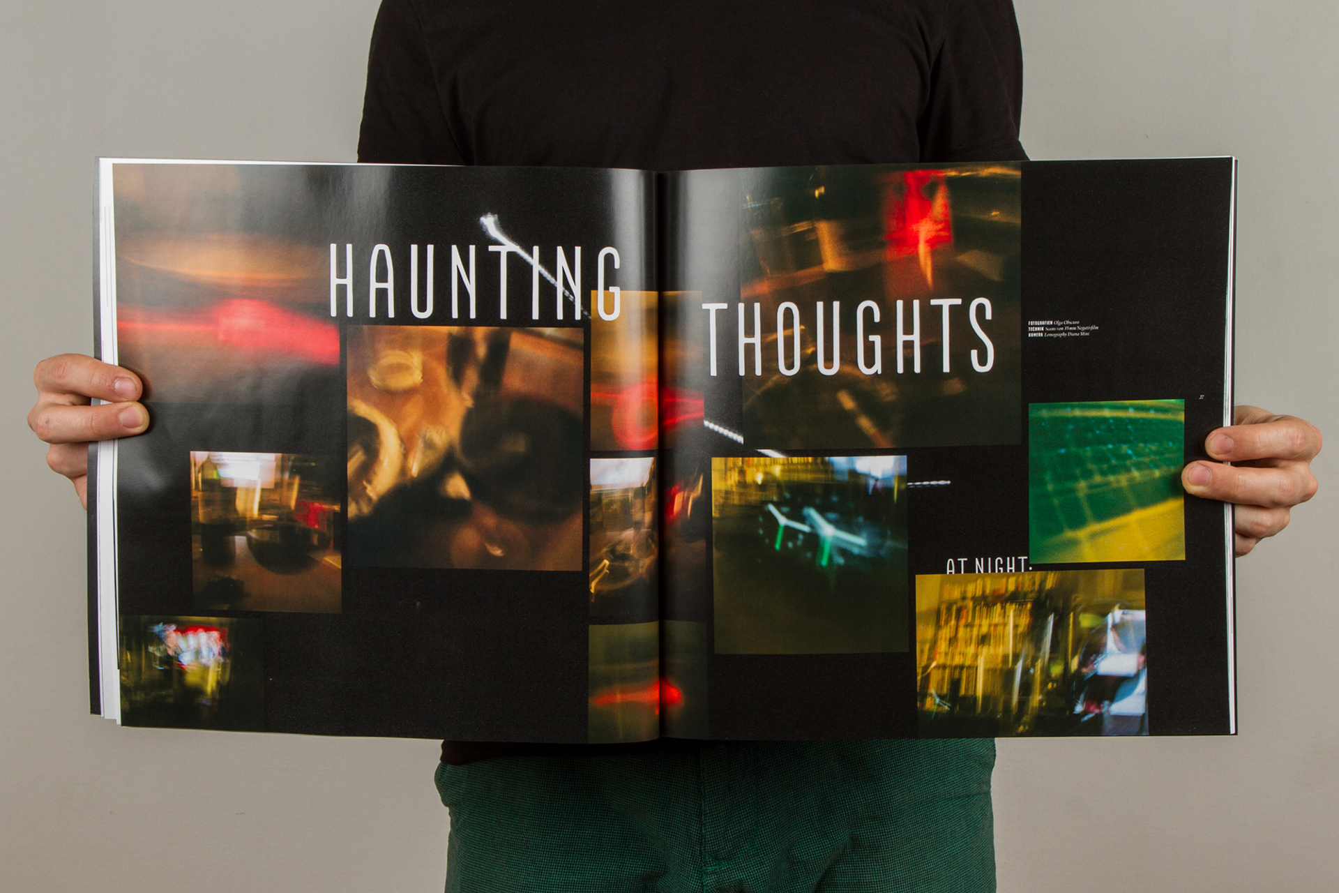
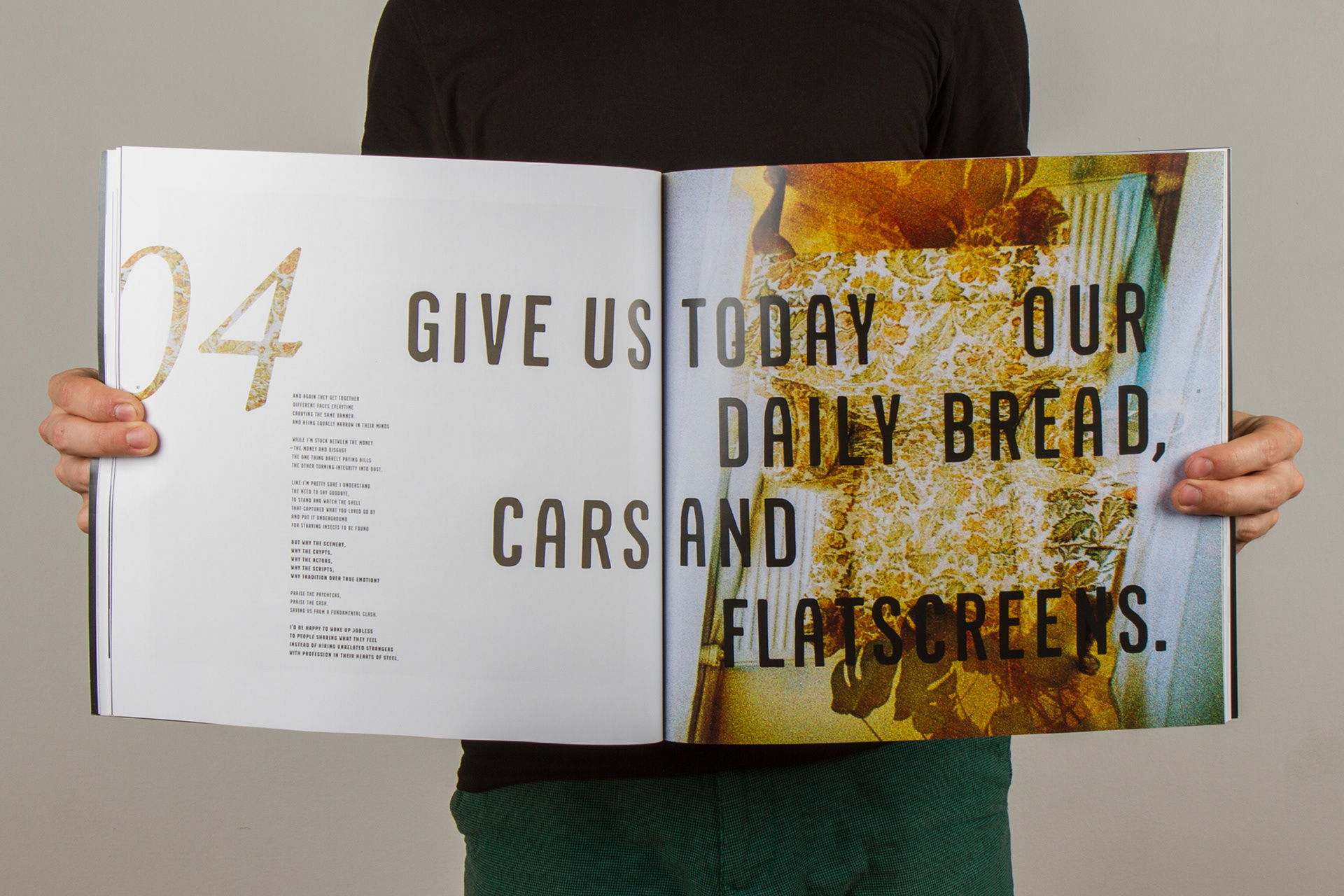
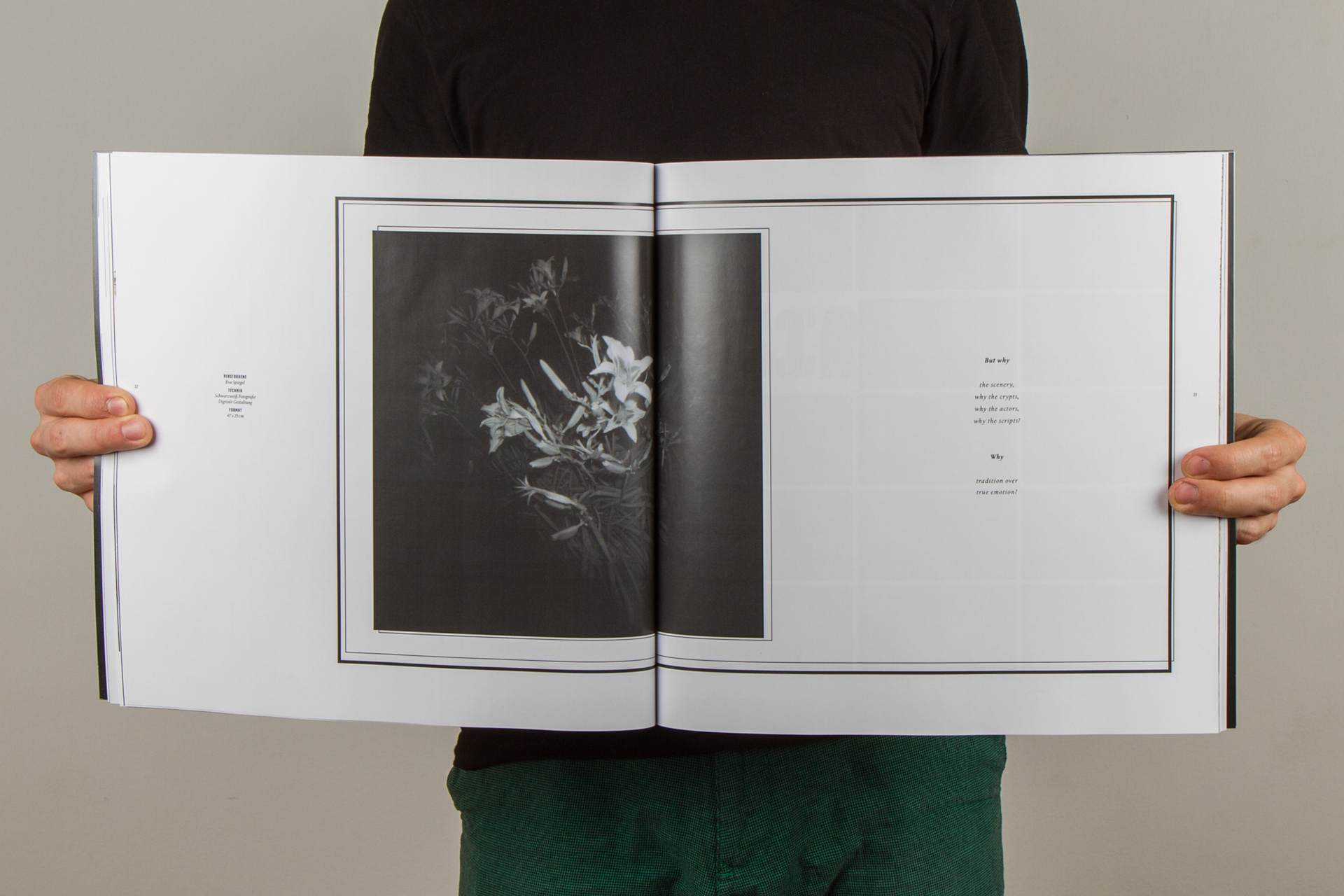
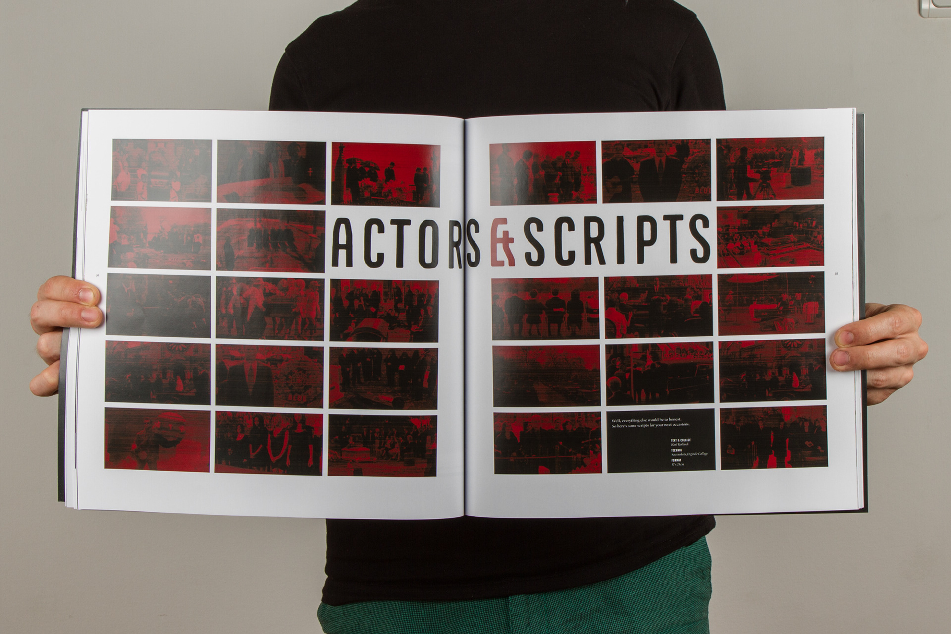
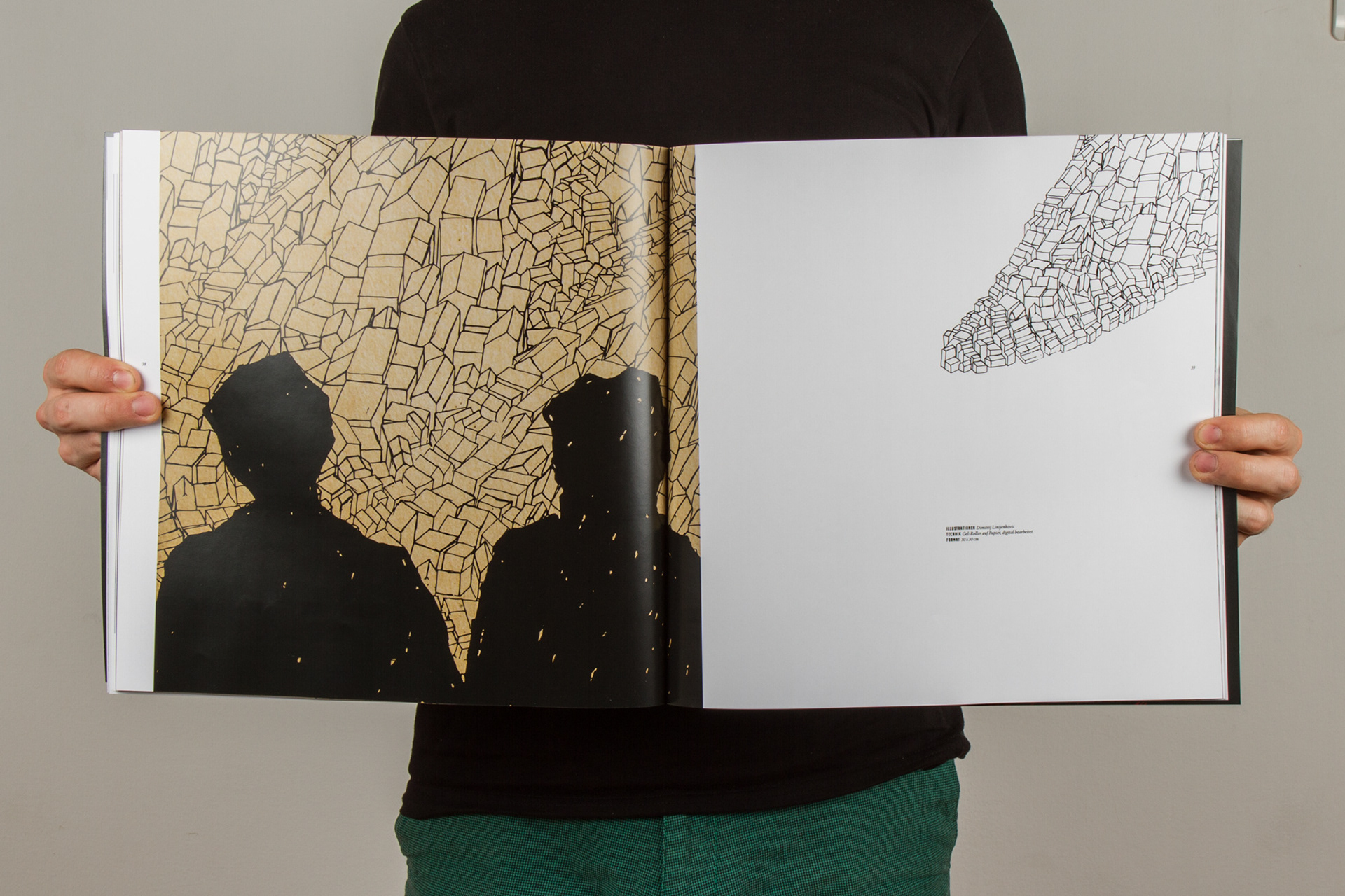
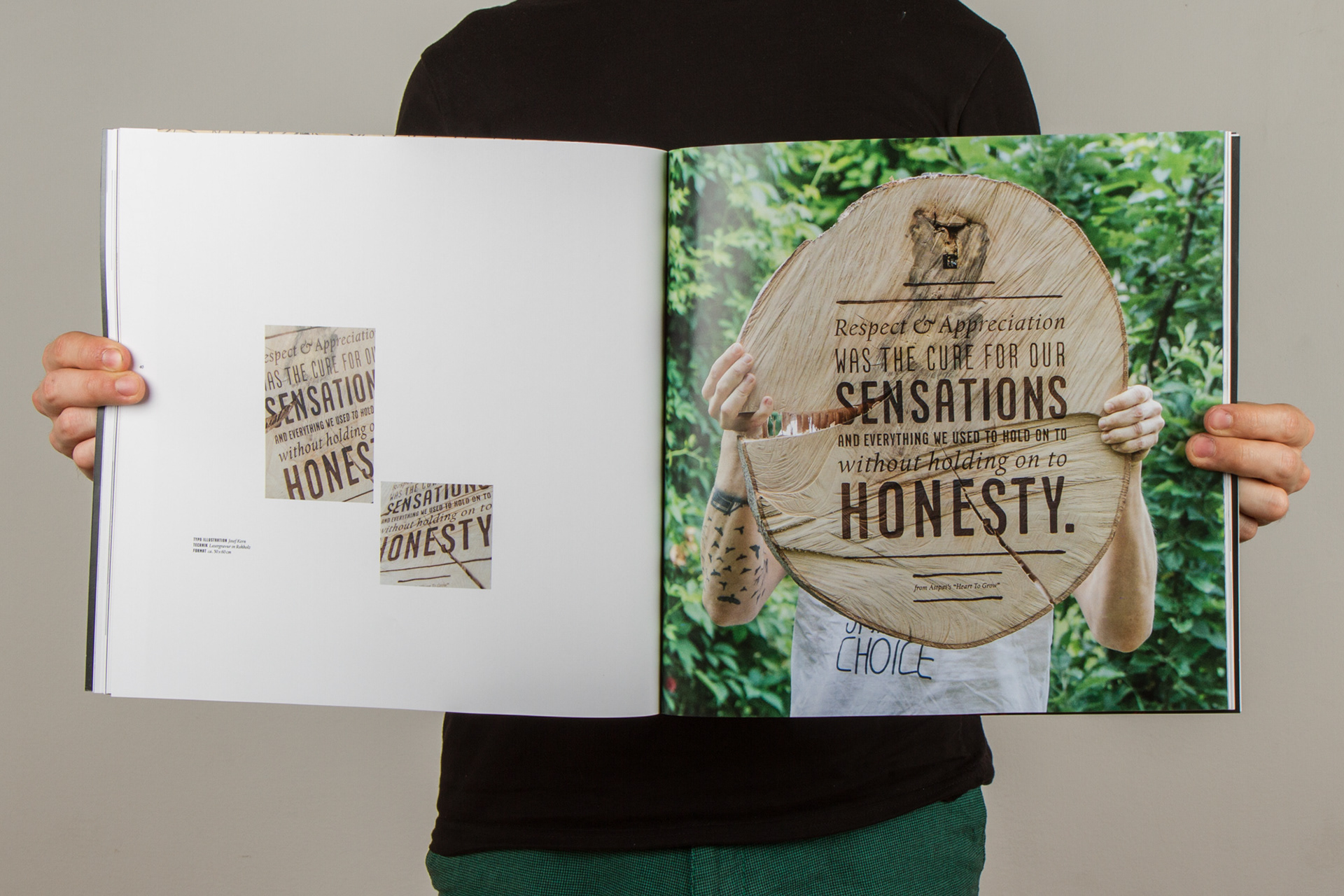
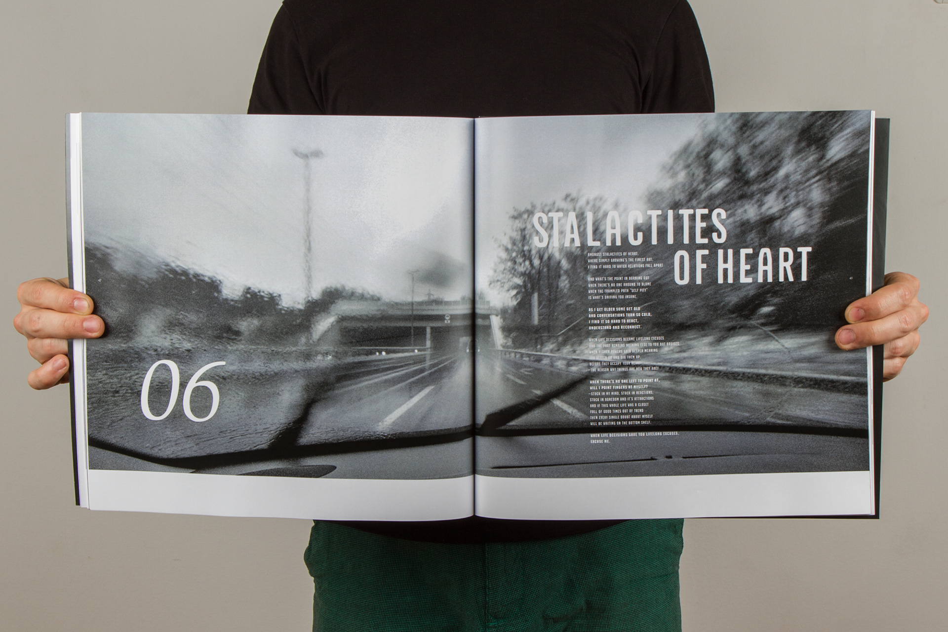
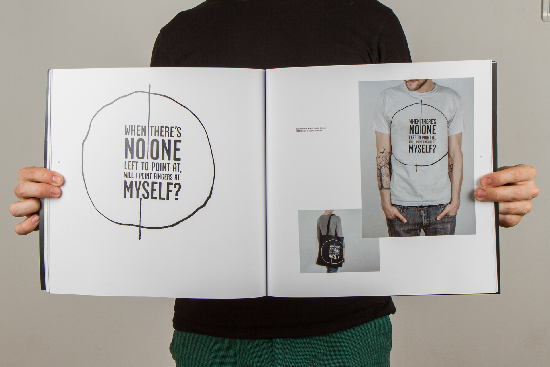
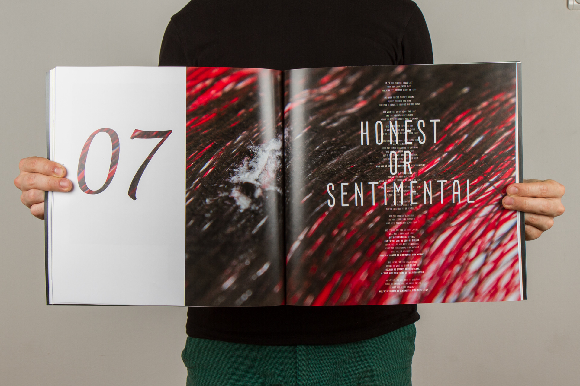
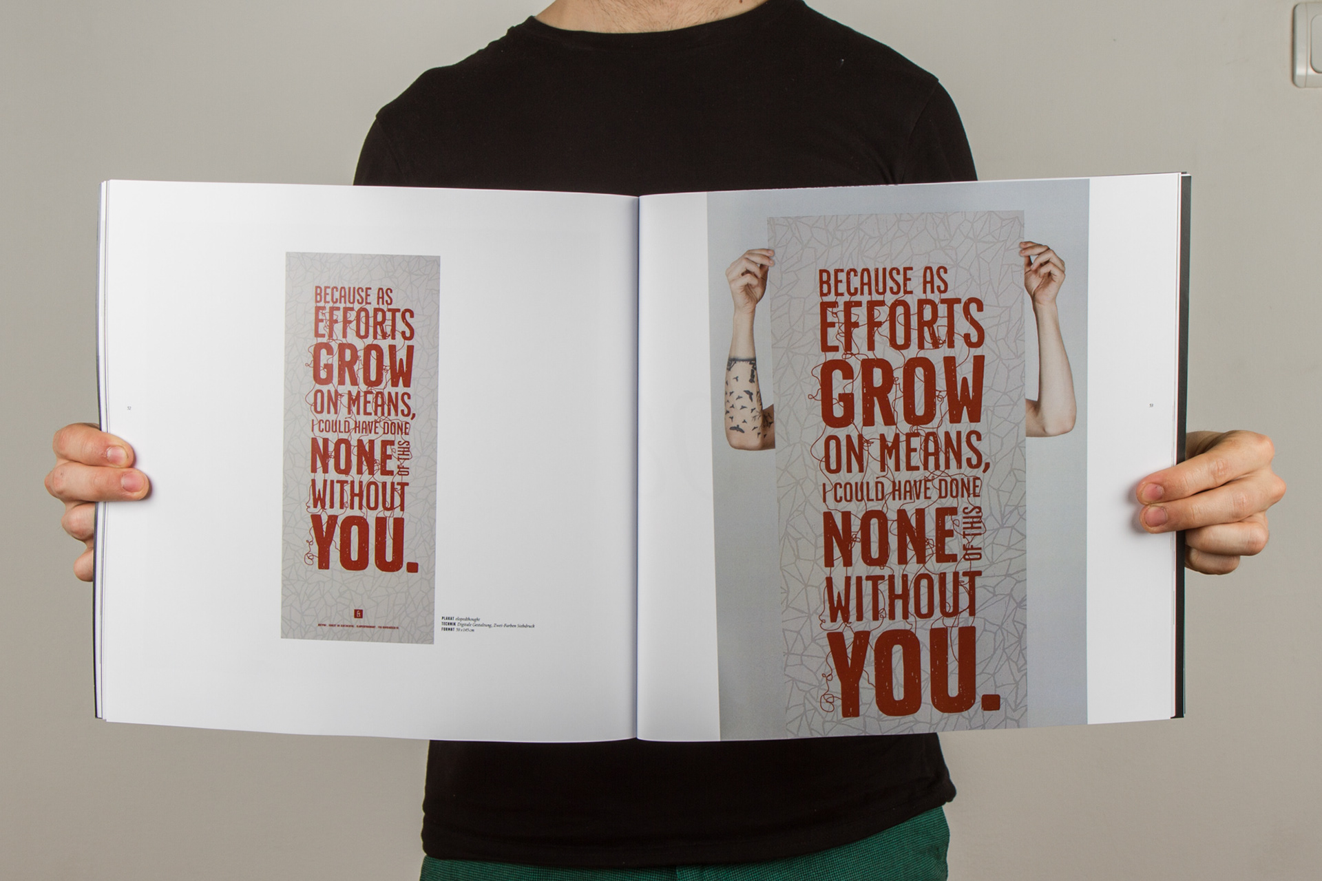
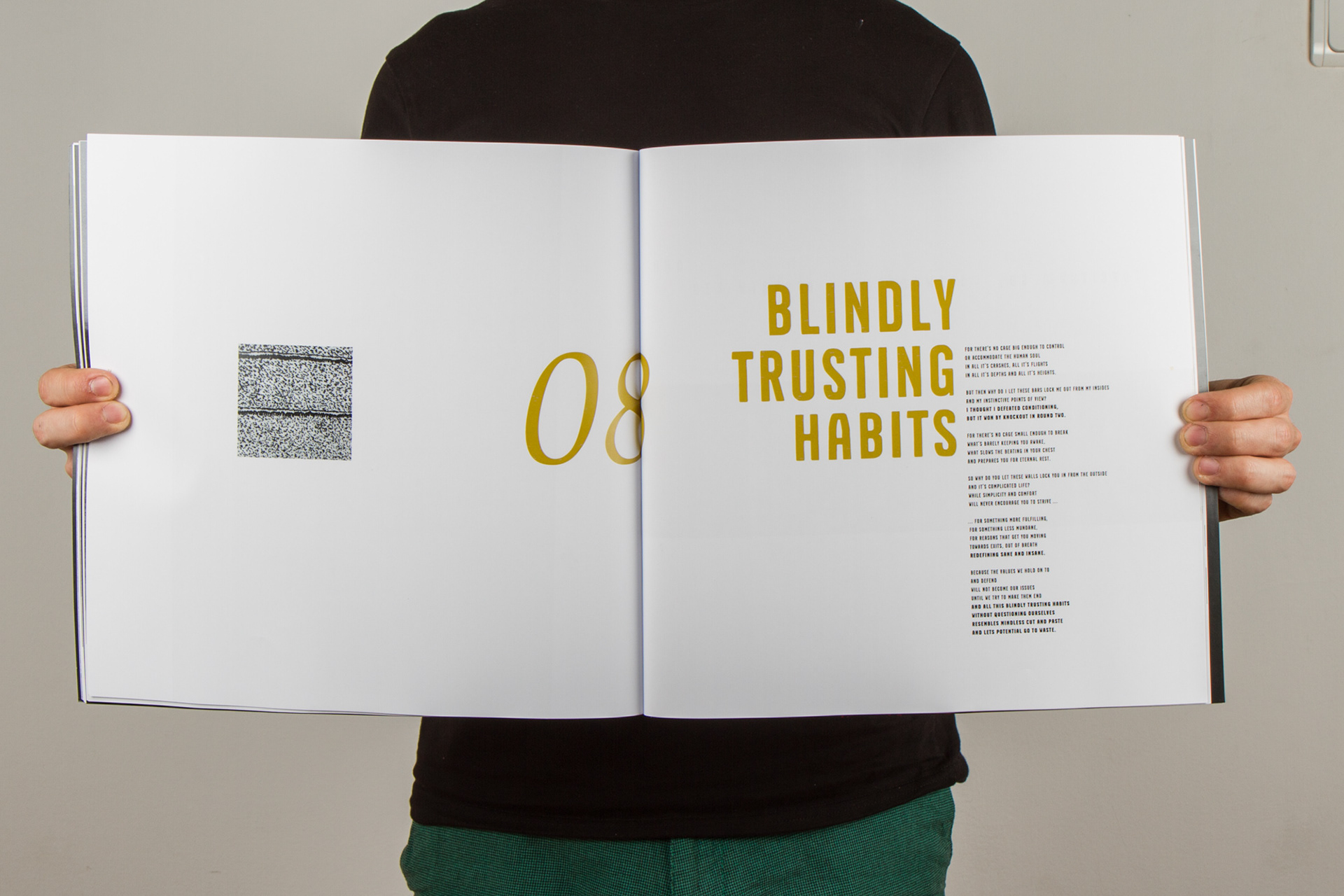
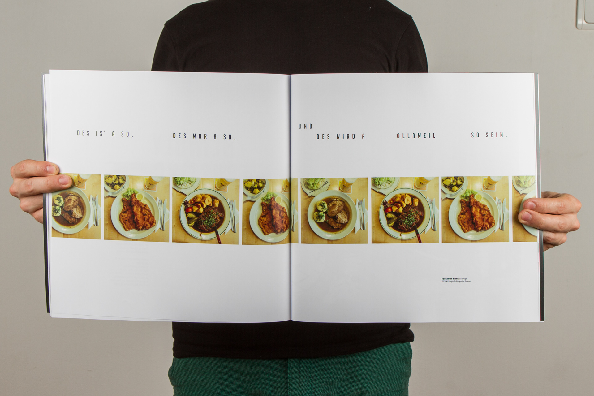
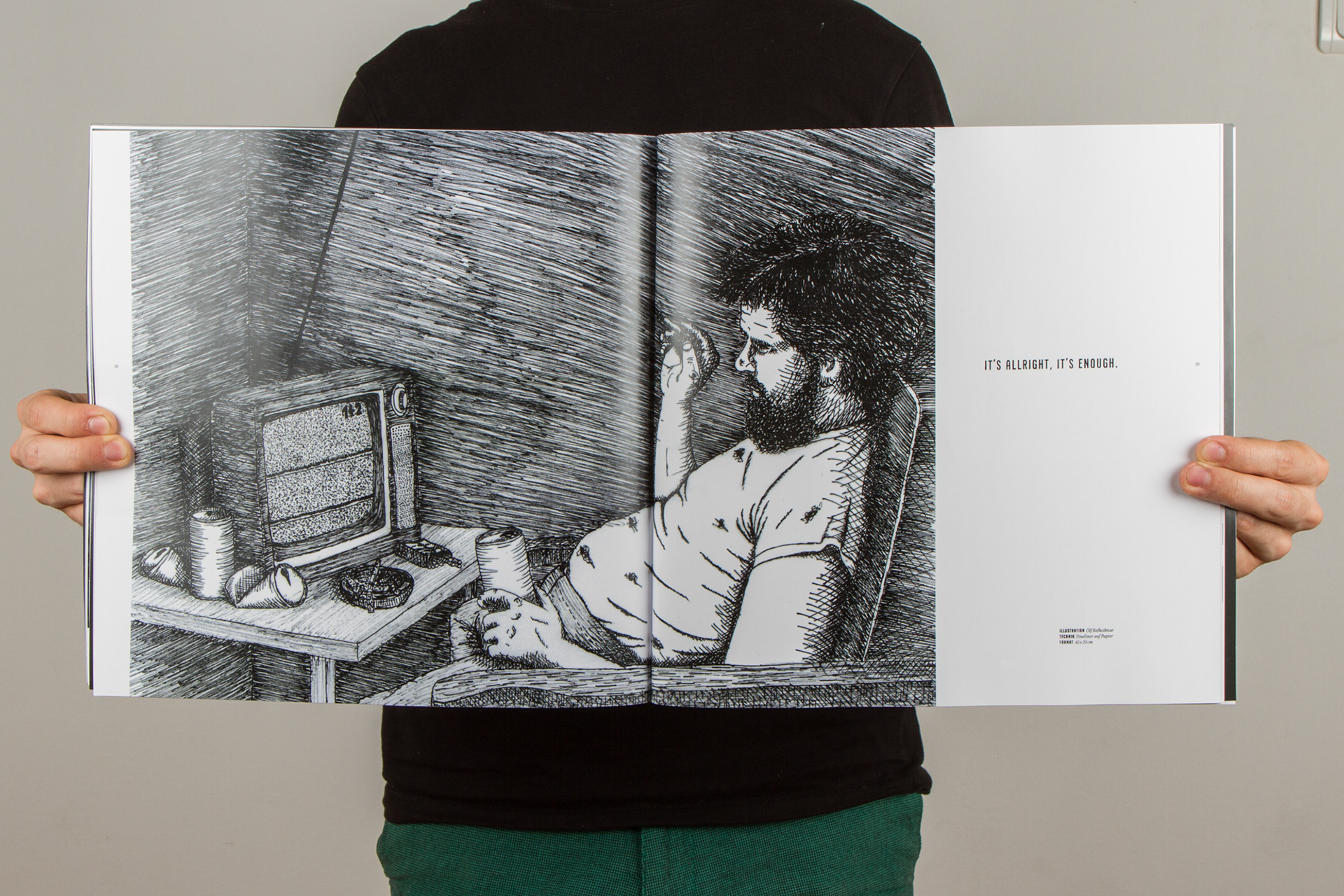
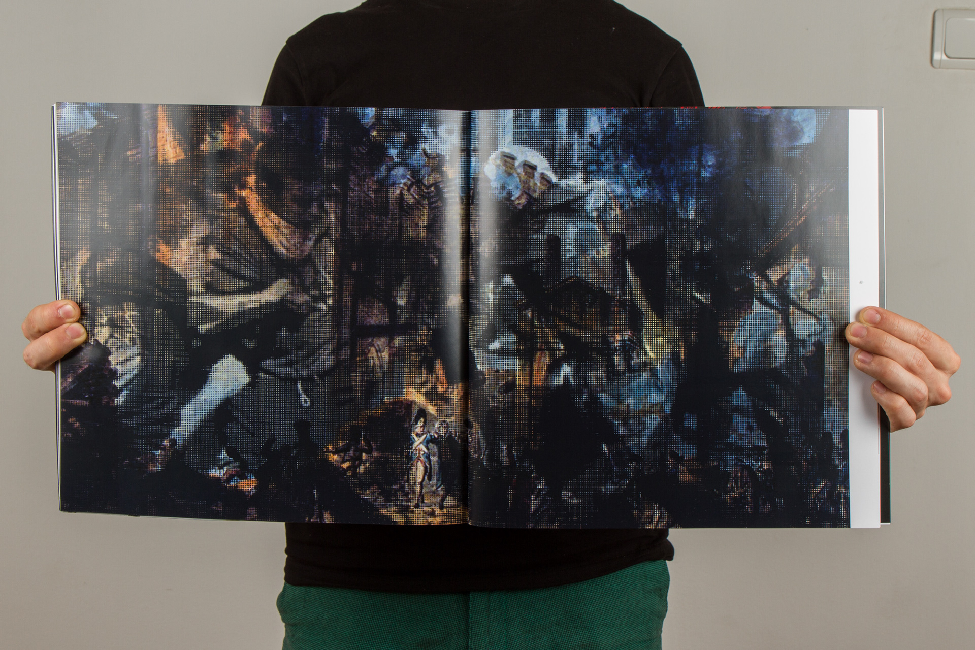
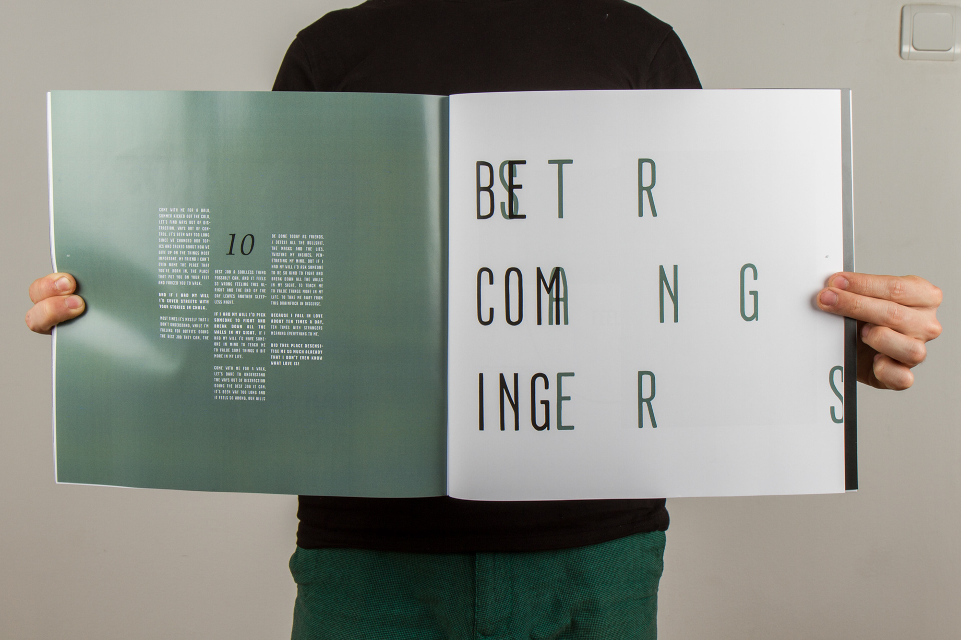
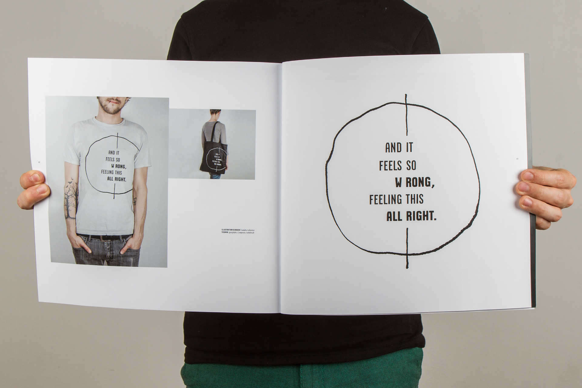
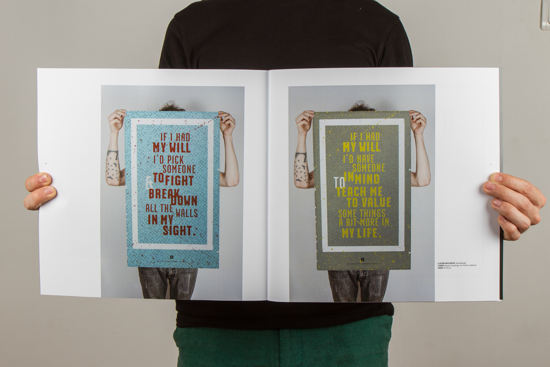
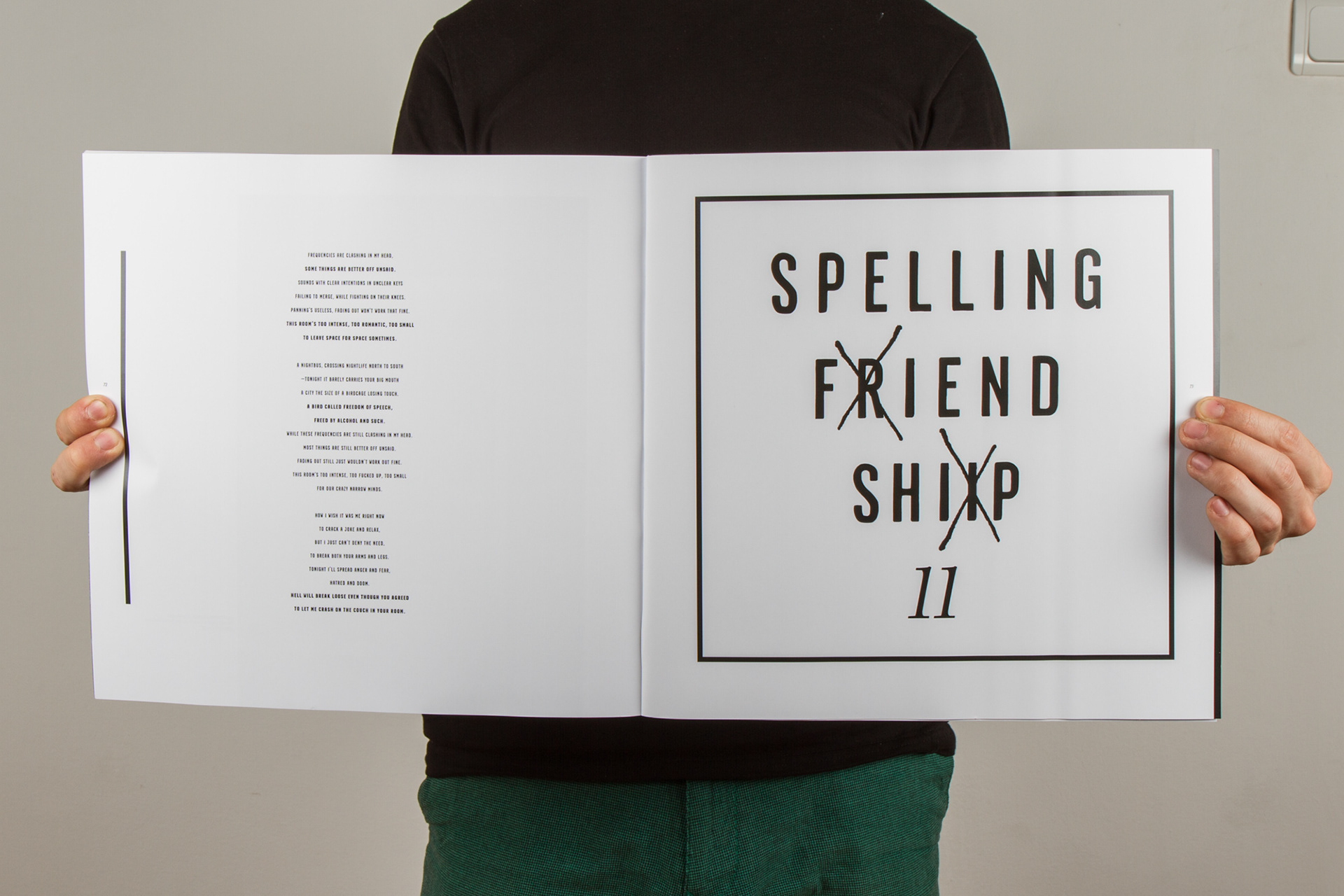
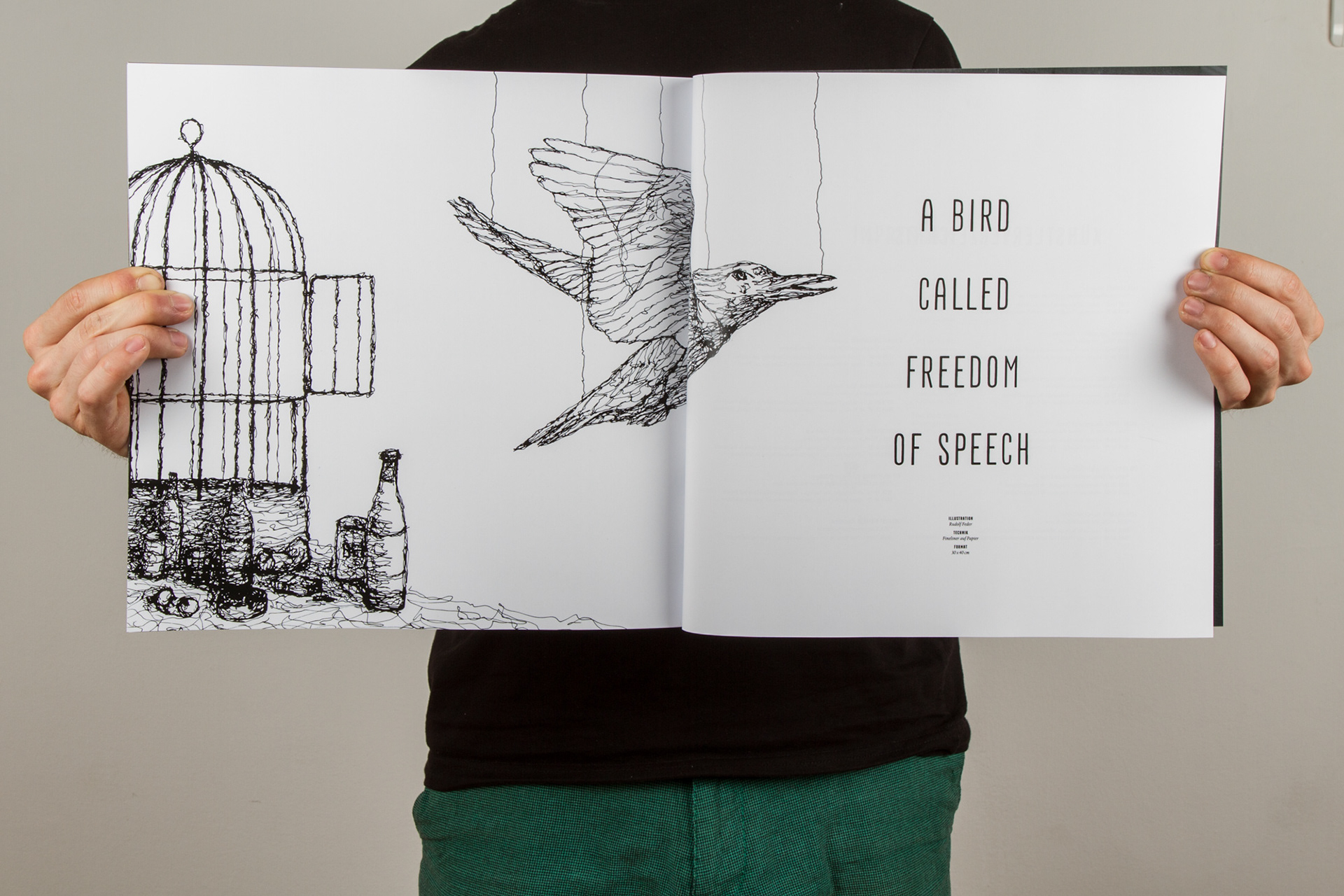
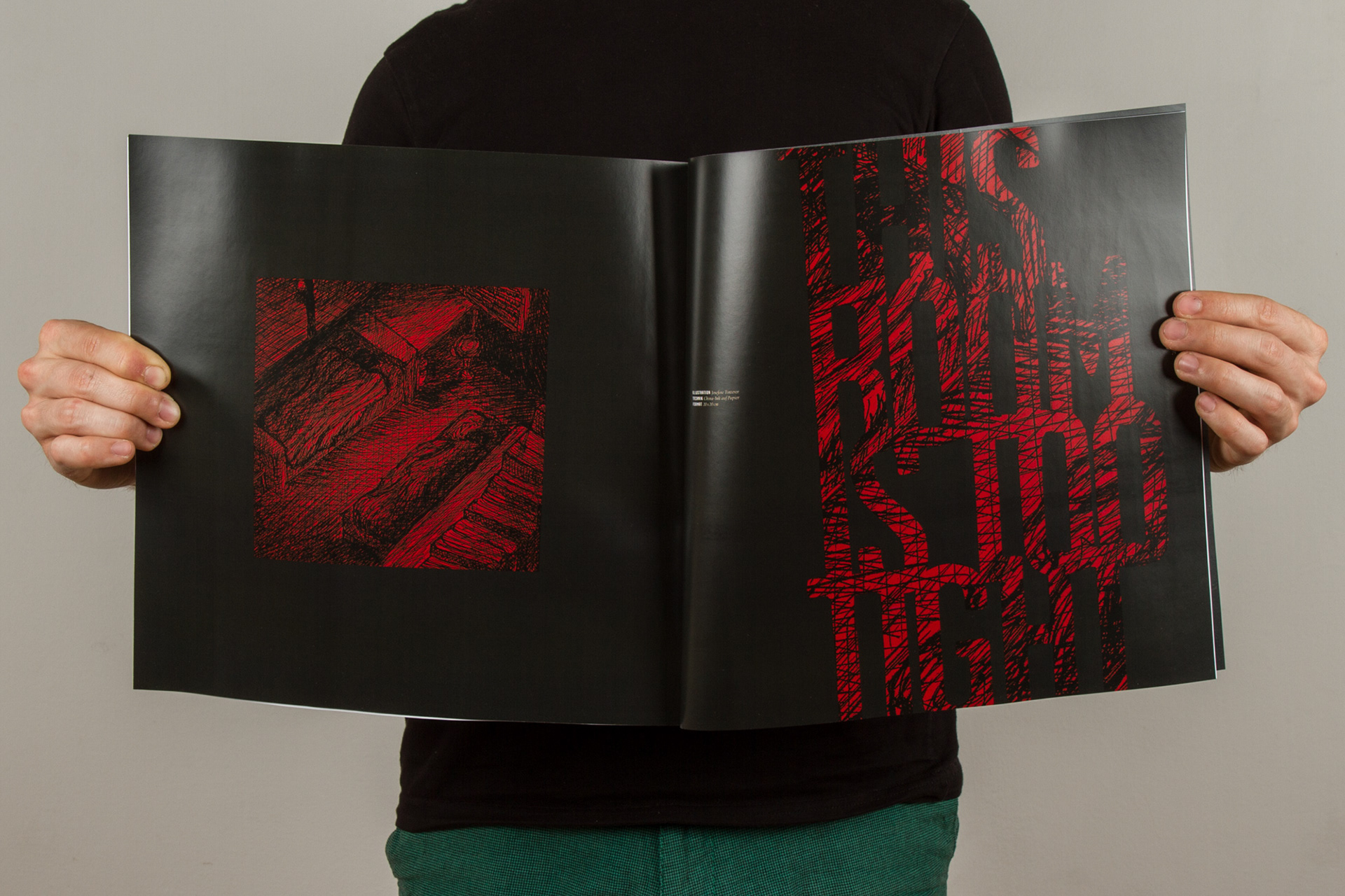
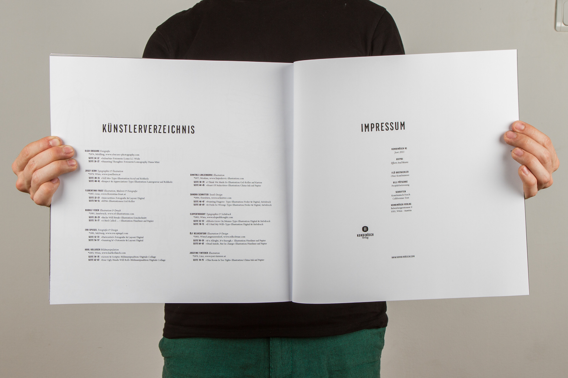
Das Magazin zeigt auf 80 Seiten Informationen zur Band, ein Interview, die Songtexte sowie 21 freie Interpretationen der Songs von 11 unterschiedlichen Künstlern. Im Rahmen des Projektes sind jedoch alle Illustrationen selbst angefertigt worden, unter der Verwendung von elf fiktiven Künstlerbiographien.
-
THE MAGAZINE
In the magazine you can find informations on the band, an interview, the lyrics to the songs and 21 free interpretations of the songs by 11 different artists. Within the scope of the project all illustrations were made by mysef, using 11 fictional artist biographies.
In the magazine you can find informations on the band, an interview, the lyrics to the songs and 21 free interpretations of the songs by 11 different artists. Within the scope of the project all illustrations were made by mysef, using 11 fictional artist biographies.
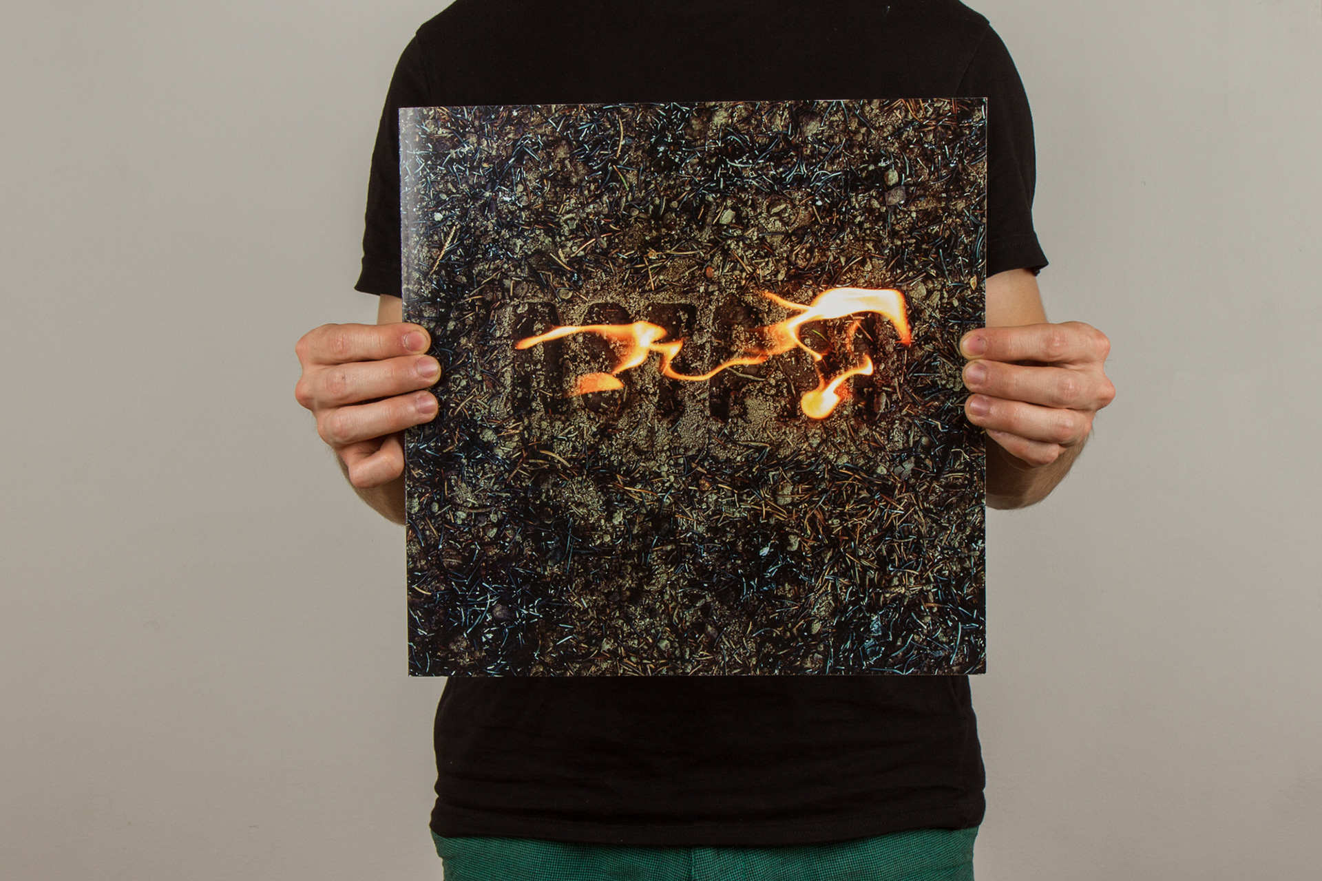


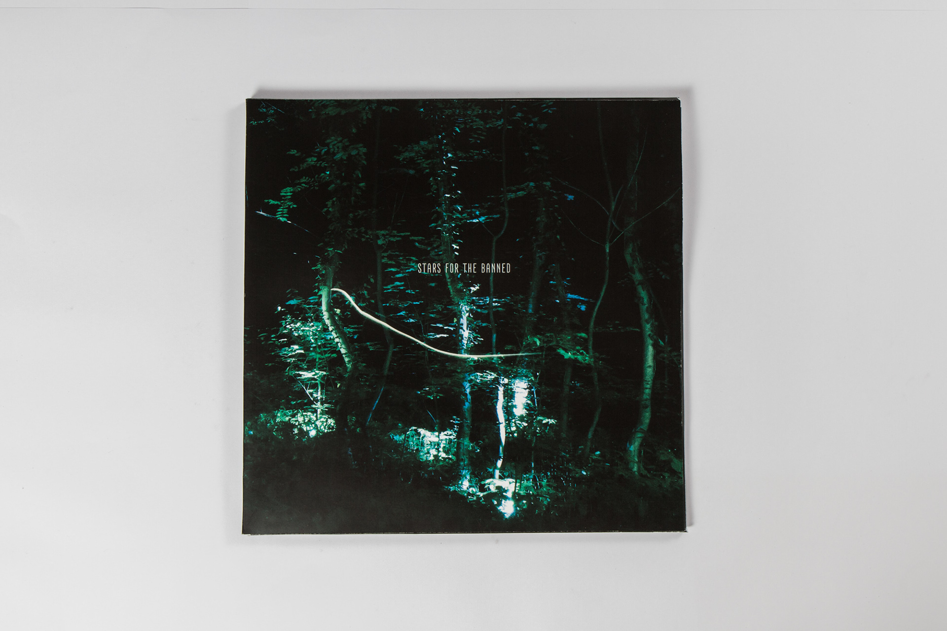
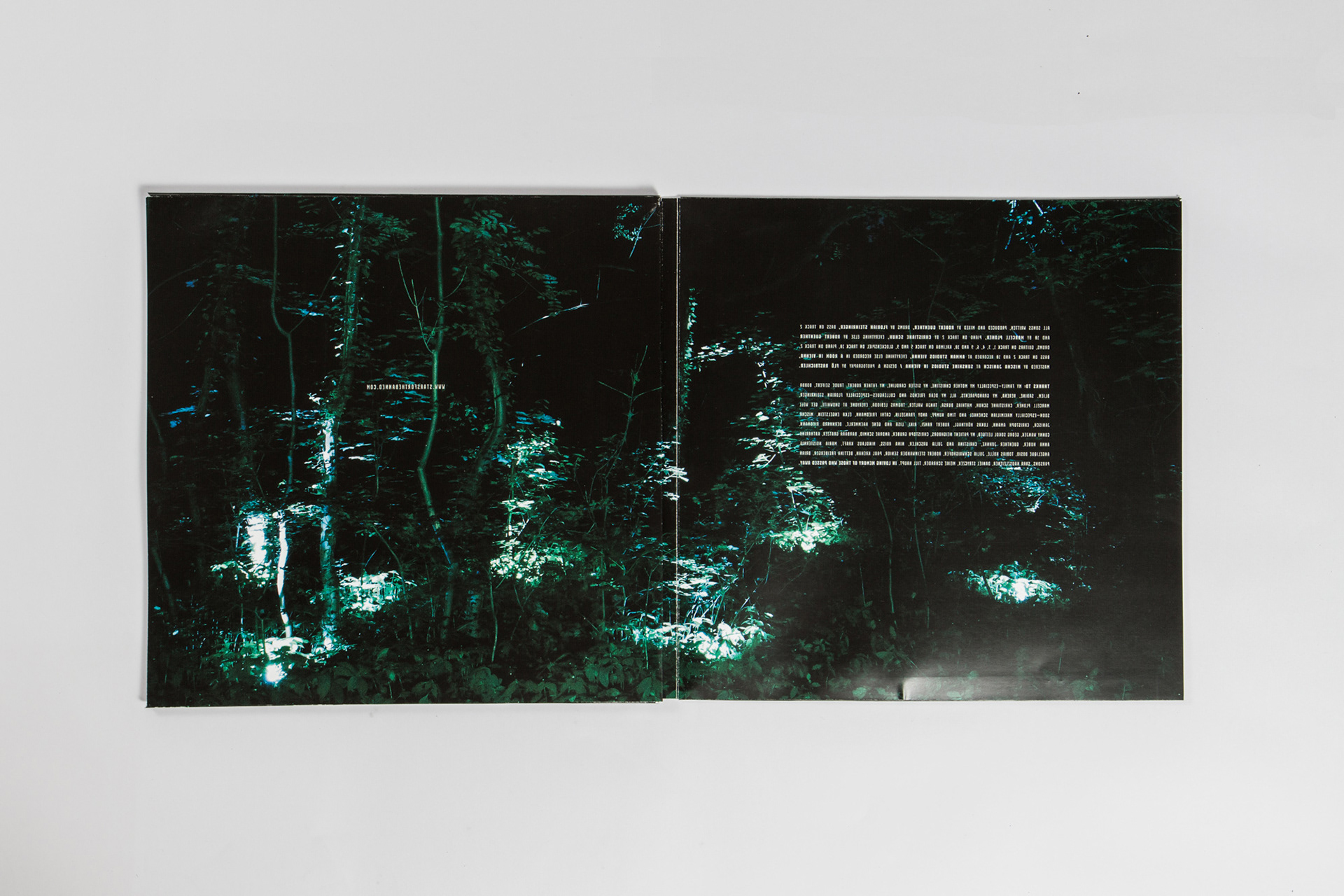
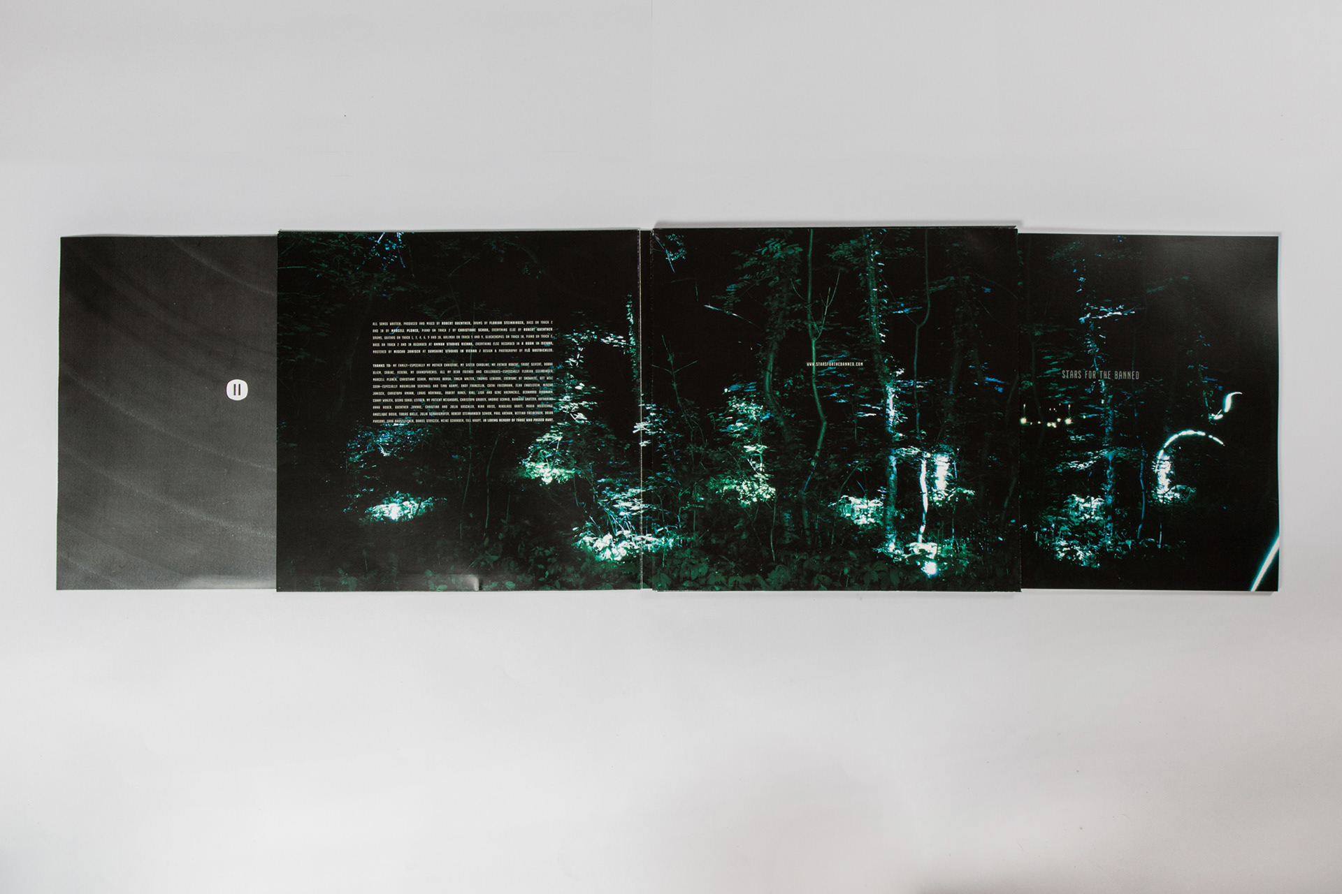

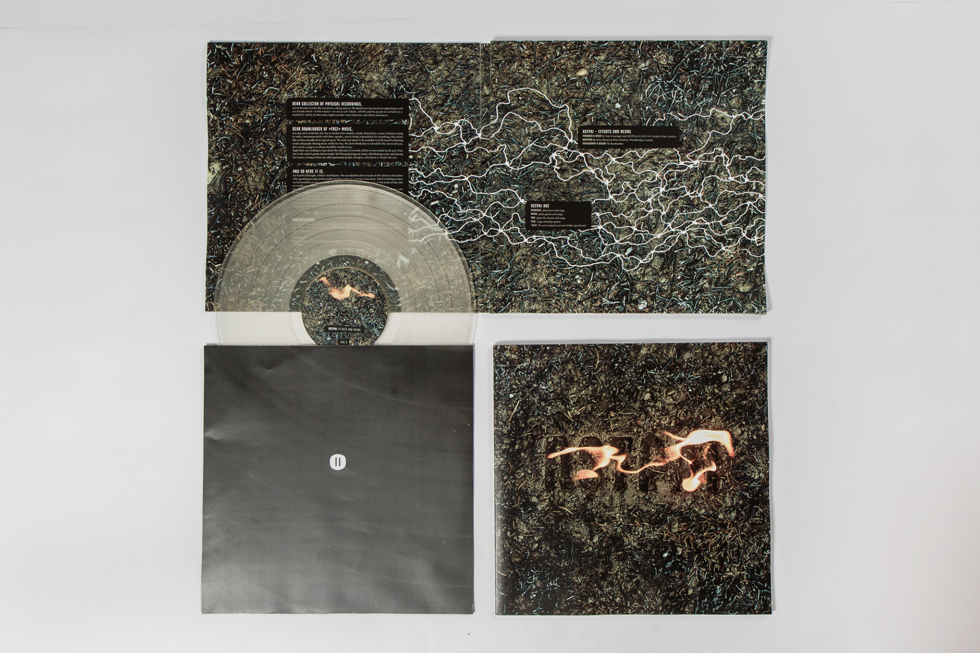
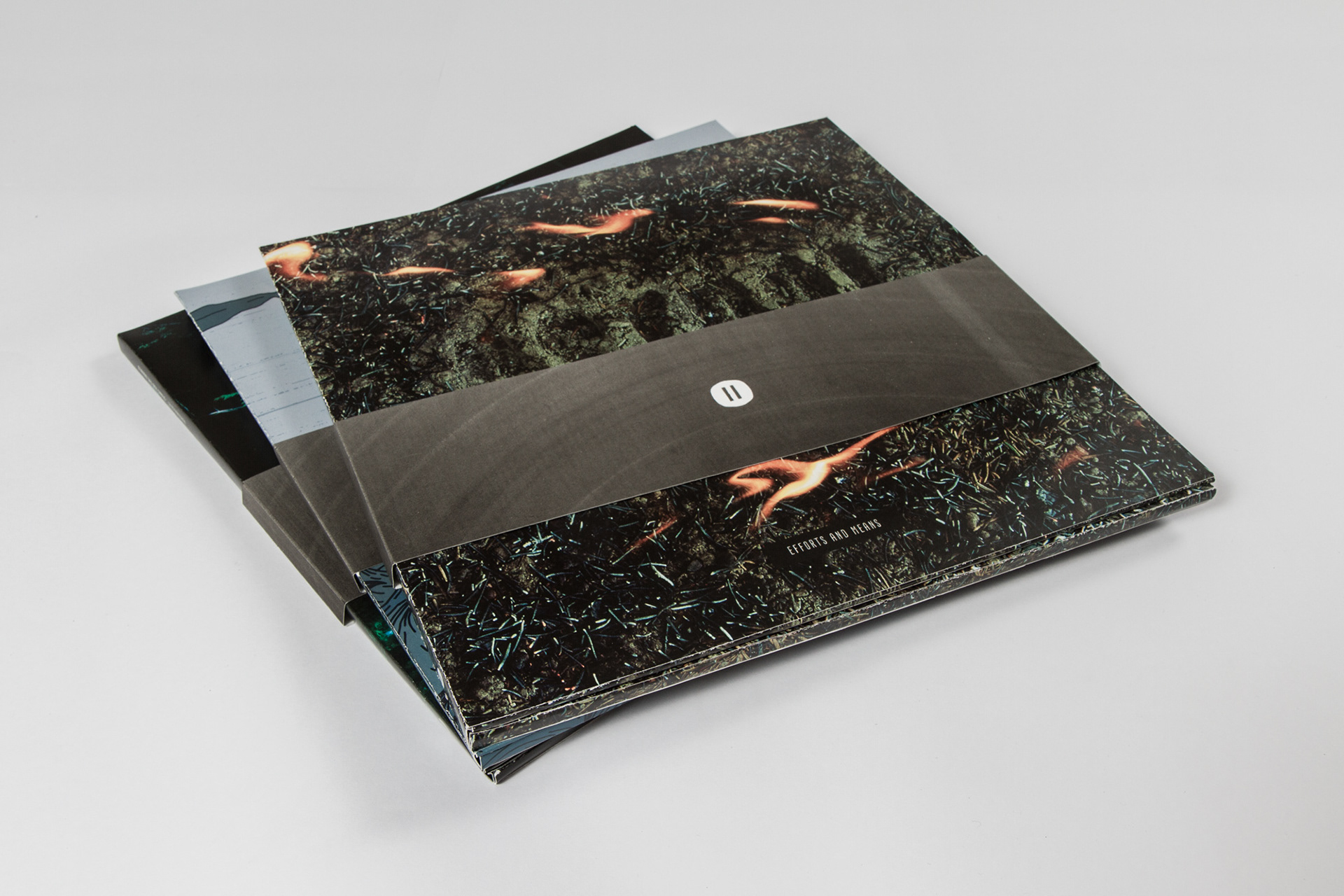
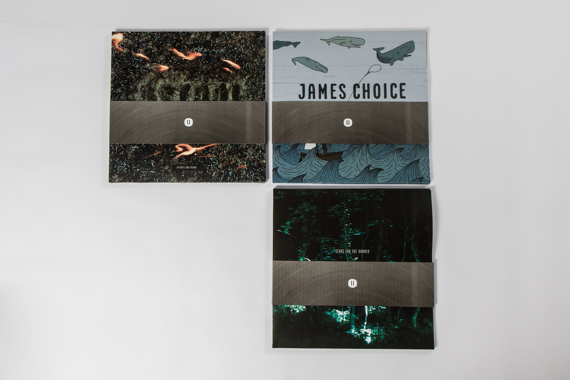
Die ersten drei Veröffentlichungen.
--
The first three releases.
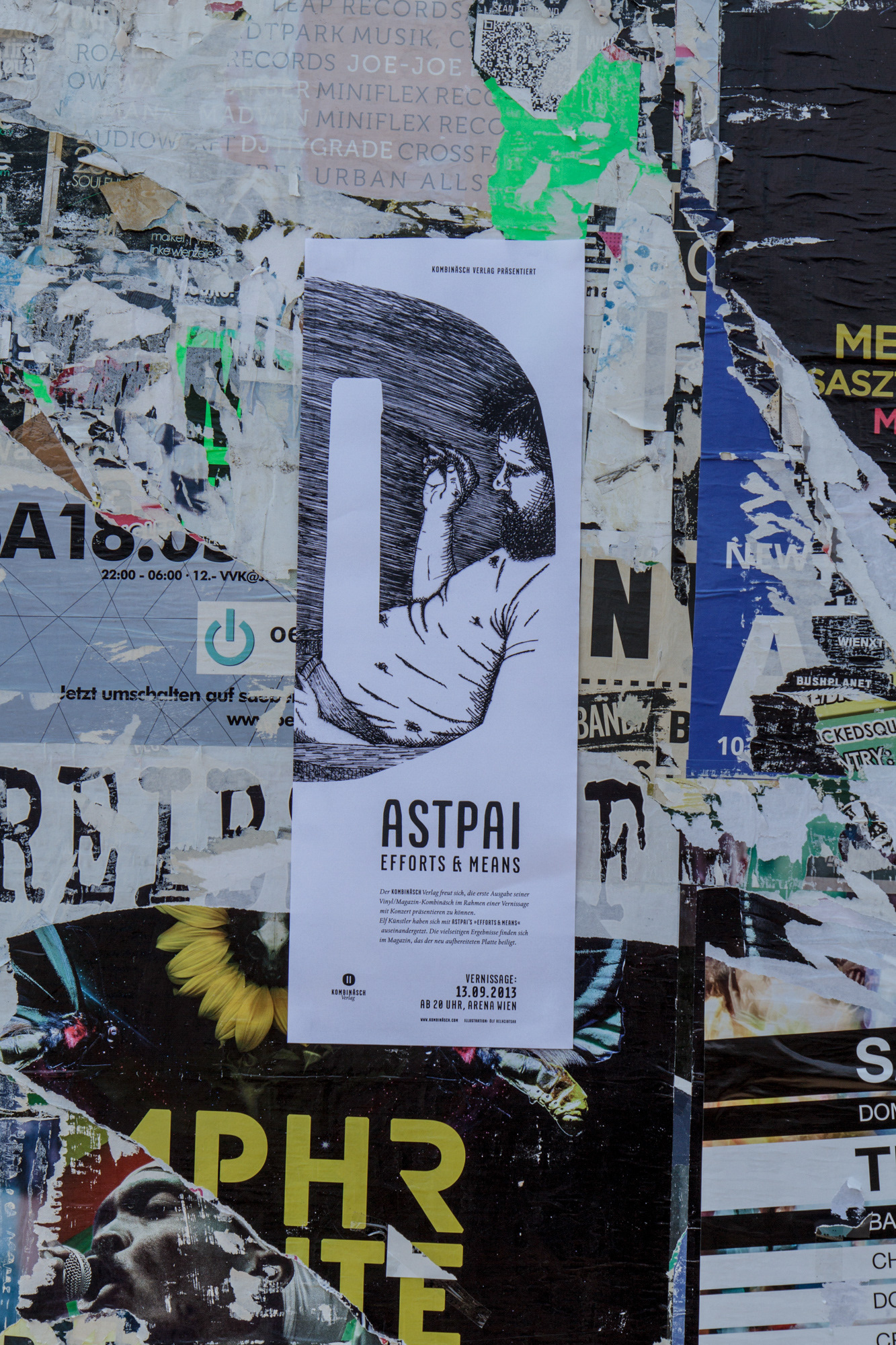
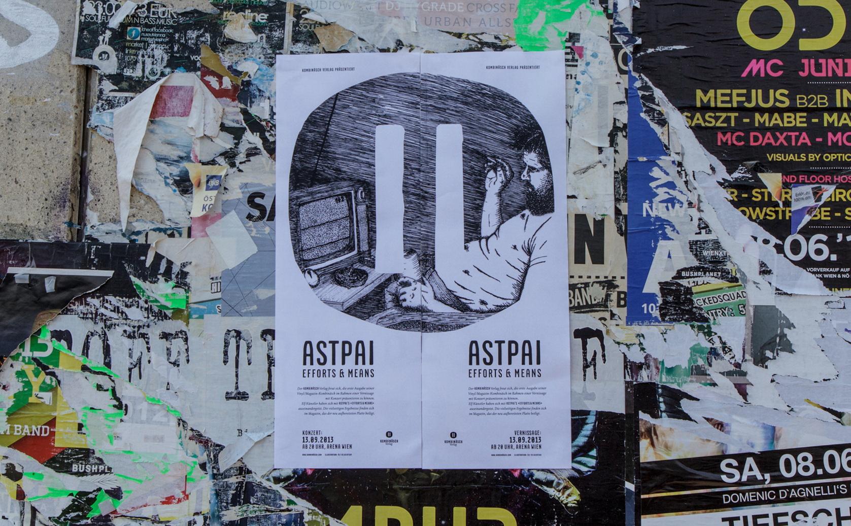
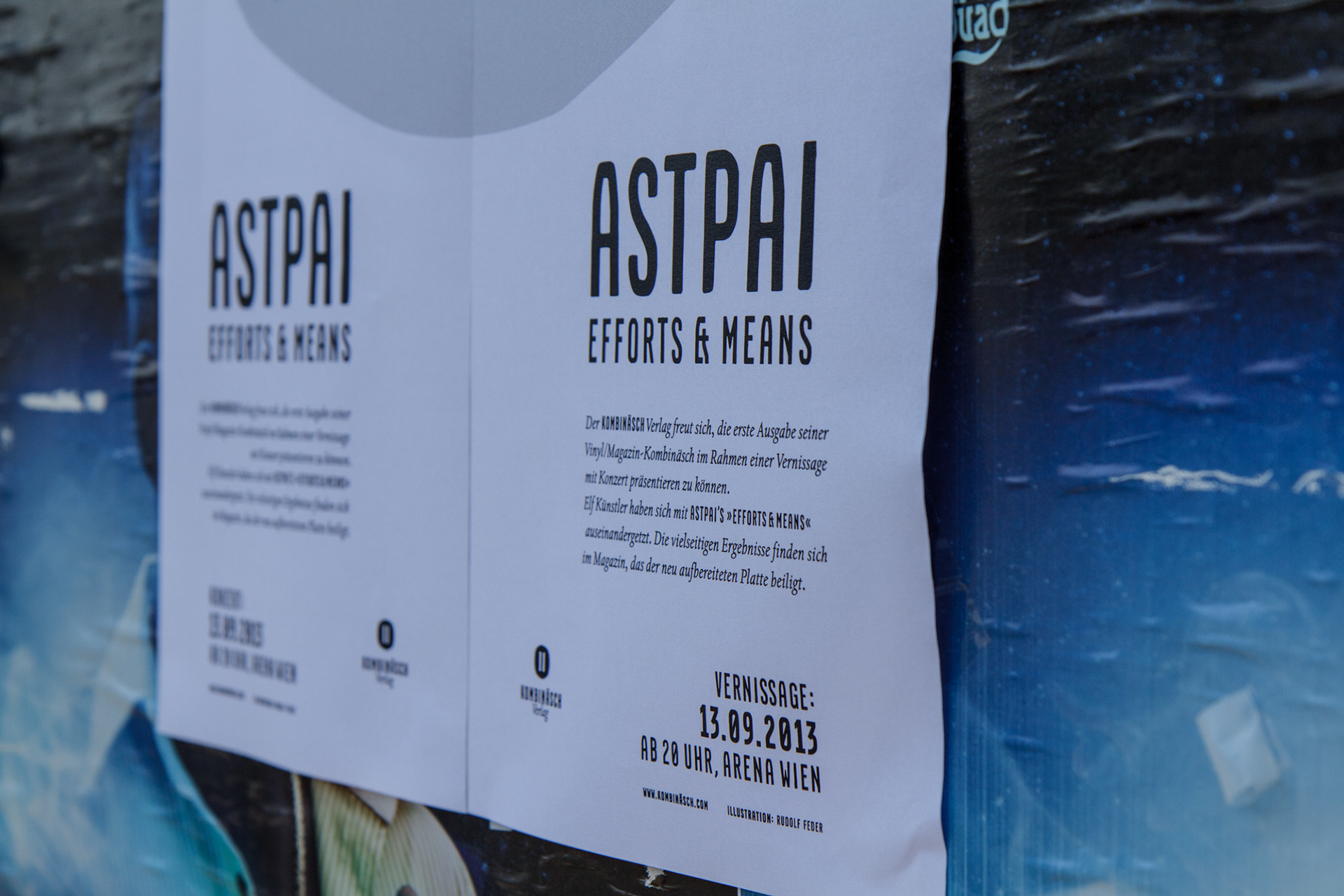
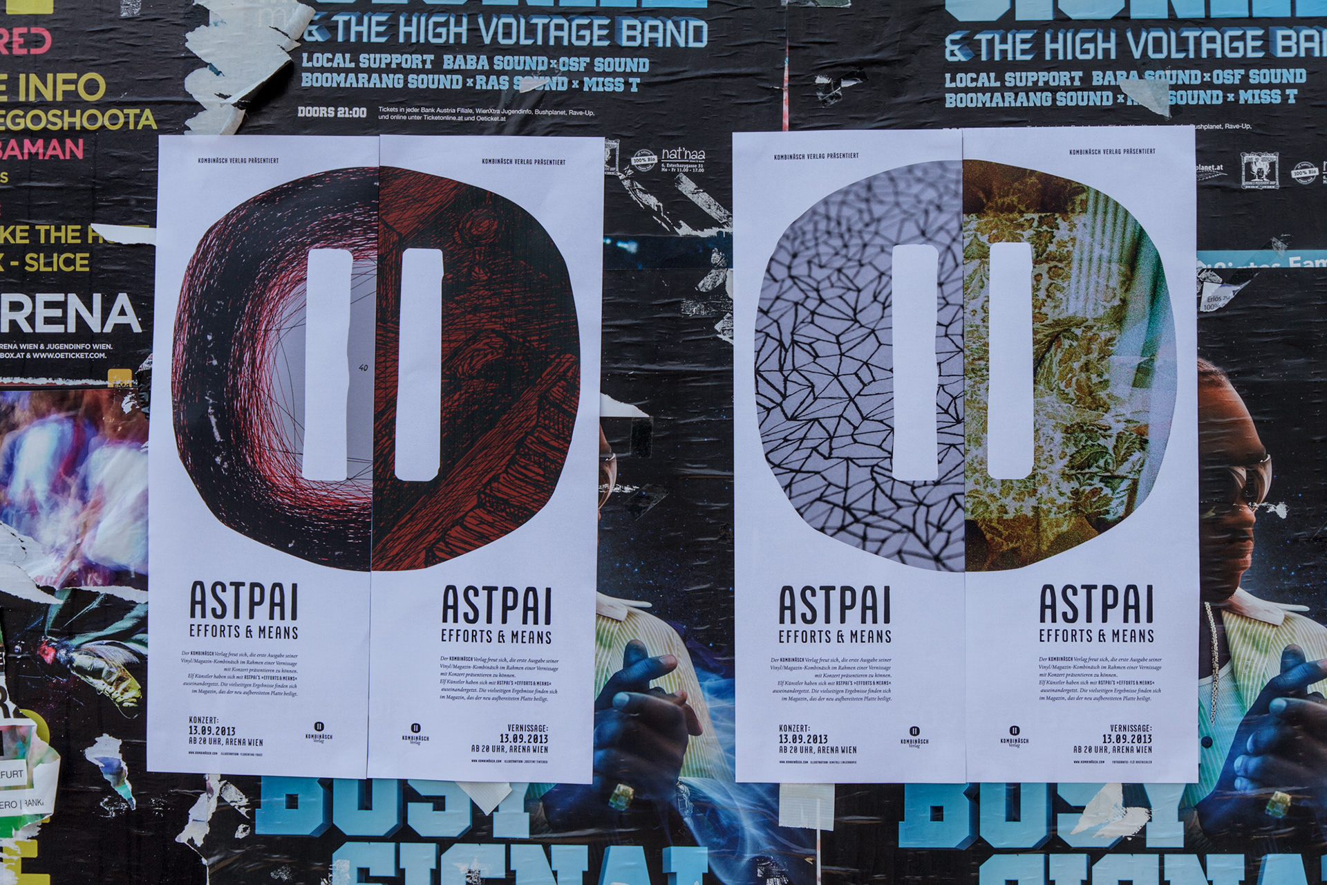
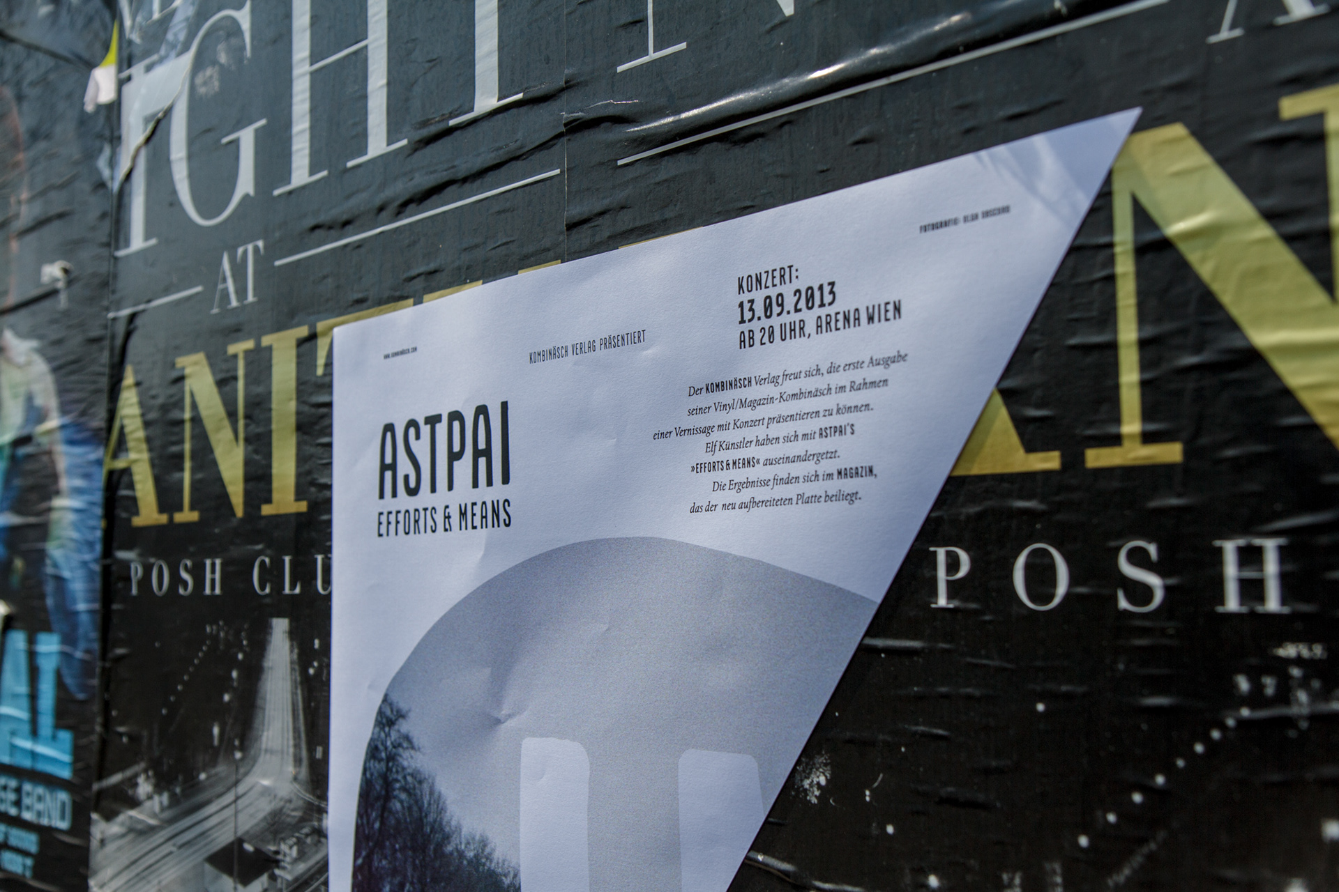
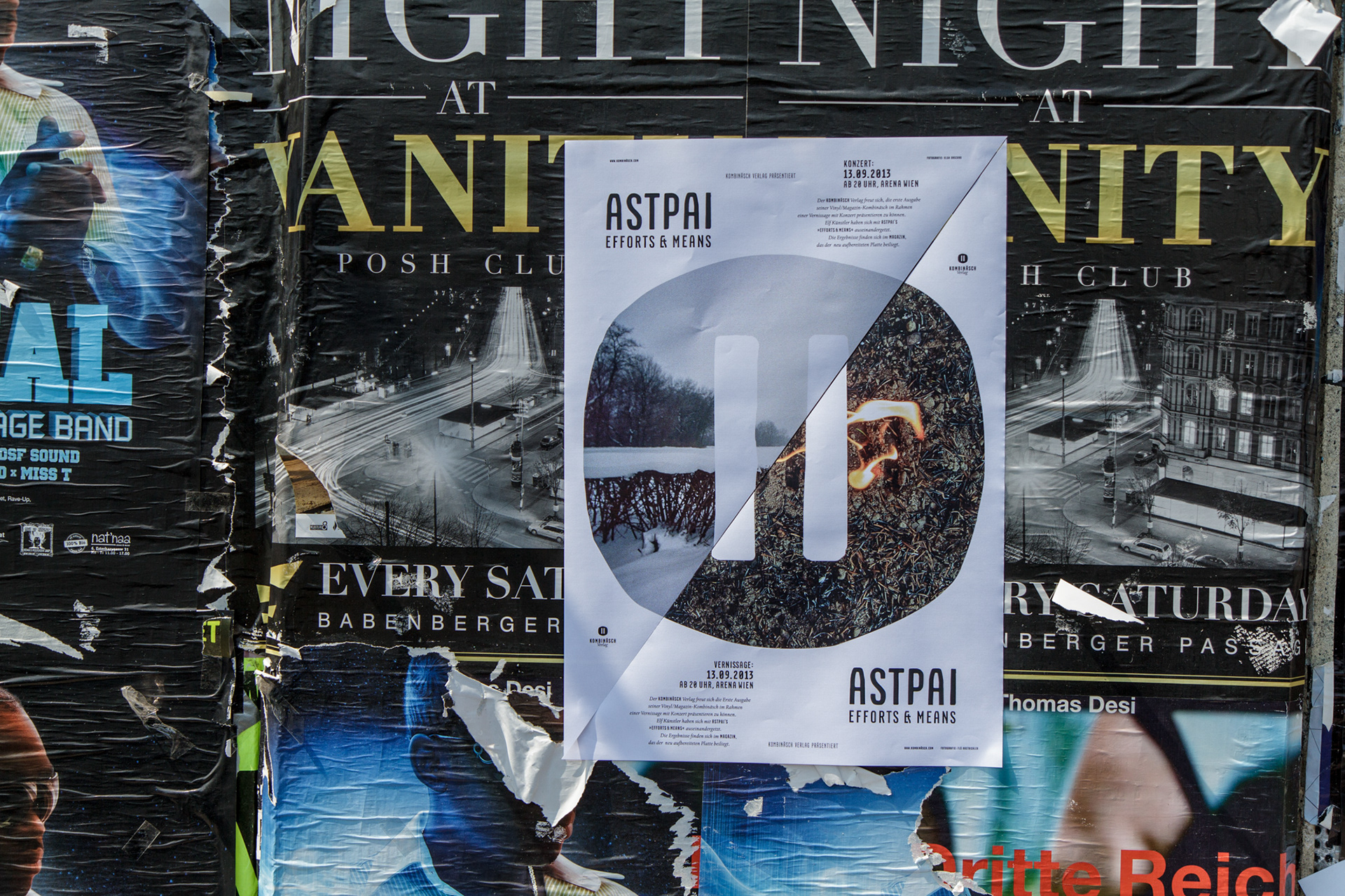
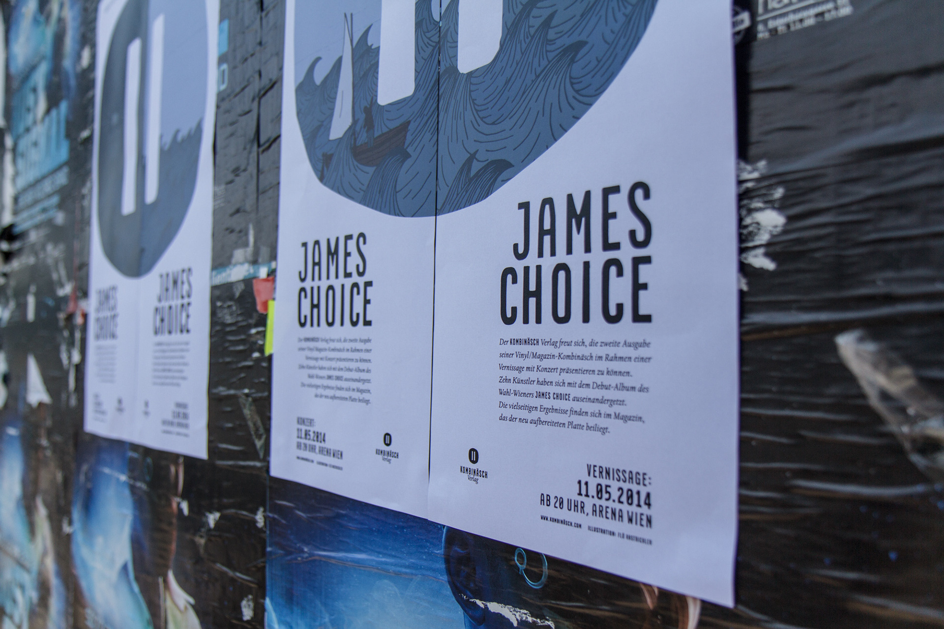
Die Plakate funktionieren modular, jeweils ein halbes A2 Format, und bewerben die jeweilige Release-Show. Diese Events bestehen aus einer Vernissage bei der alle Arbeiten aus dem Magazin gezeigt werden und einer Live-Show der jeweiligen Band. Der linke Teil des Plakates bewirbt das Konzert, der rechte Teil die Vernissage. Nachdem beides ein und der selbe Event ist, funktionieren die Plakate für sich alleine, und gemeinsam. Mehrere Arbeiten aus dem Magazin, sowie Platten und Magazincover, können dabei frei kombiniert werden.
---
THE POSTERS
To promote the release-shows, a modular poster-system was created. These events consist of an art show and a live gig by the band involved in the release. The left part of the poster promotes the concert, the right part tells about the art-show. Since it's both the same event, the poster work on their own, and combined into a full A2 sheet. Different works from the magazine, as well as the record and magazine covers can be combined freely.
To promote the release-shows, a modular poster-system was created. These events consist of an art show and a live gig by the band involved in the release. The left part of the poster promotes the concert, the right part tells about the art-show. Since it's both the same event, the poster work on their own, and combined into a full A2 sheet. Different works from the magazine, as well as the record and magazine covers can be combined freely.


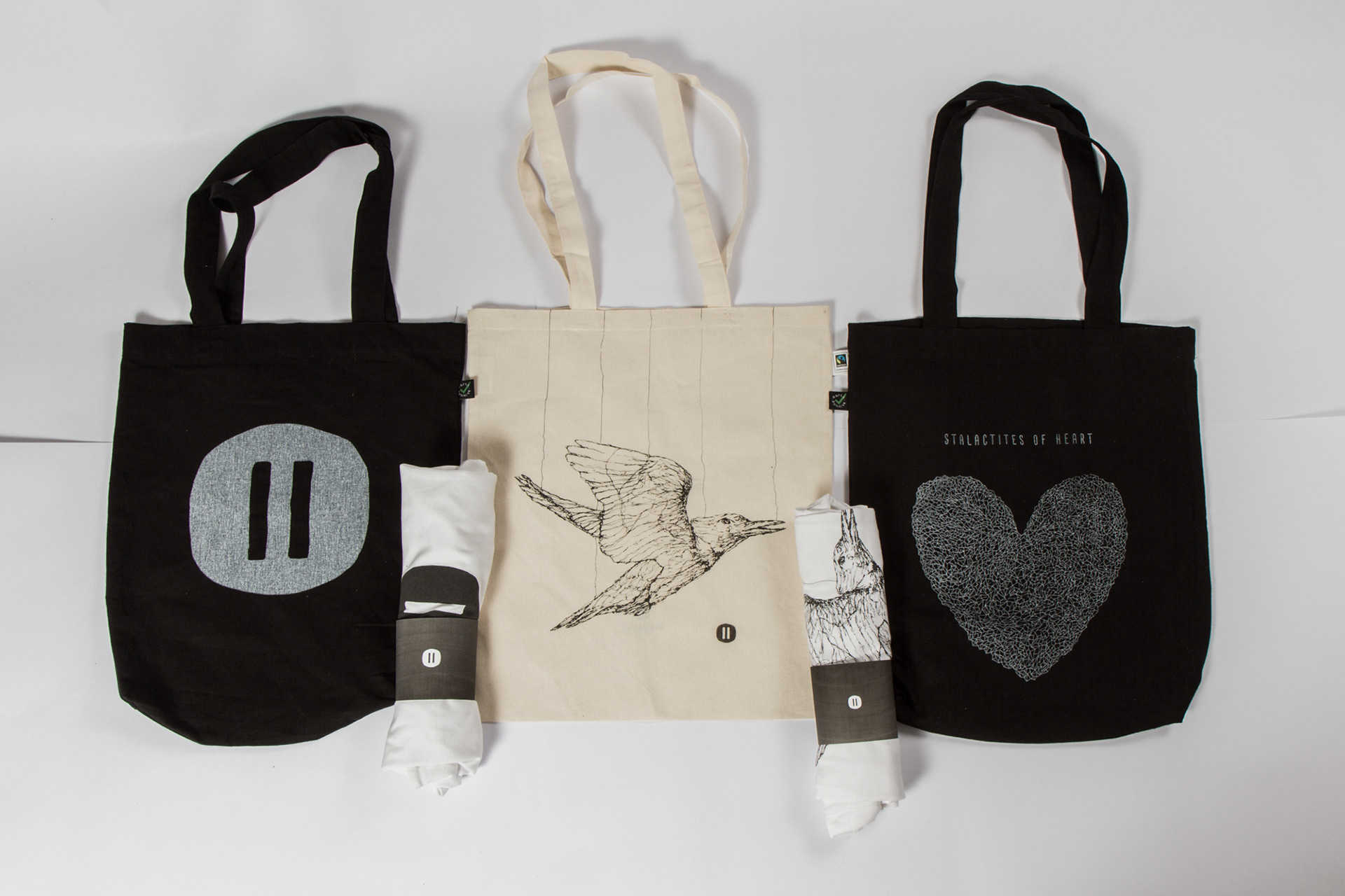
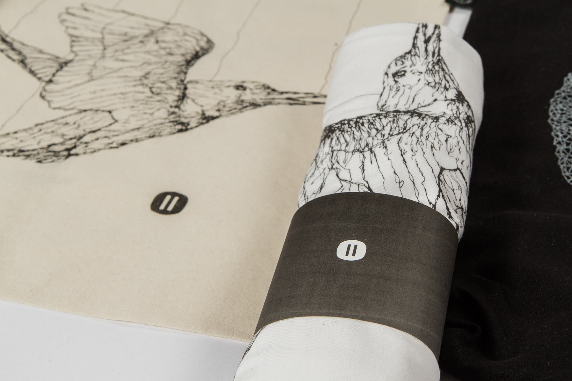
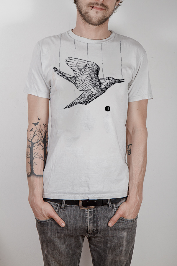
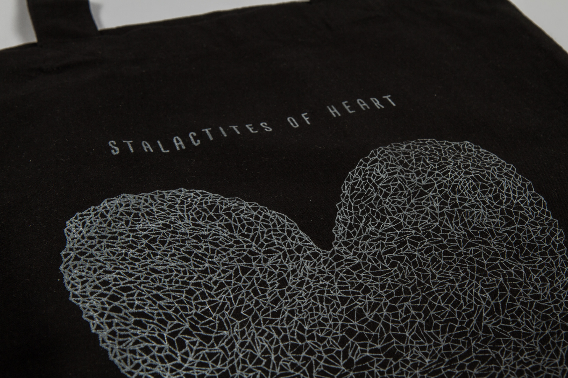
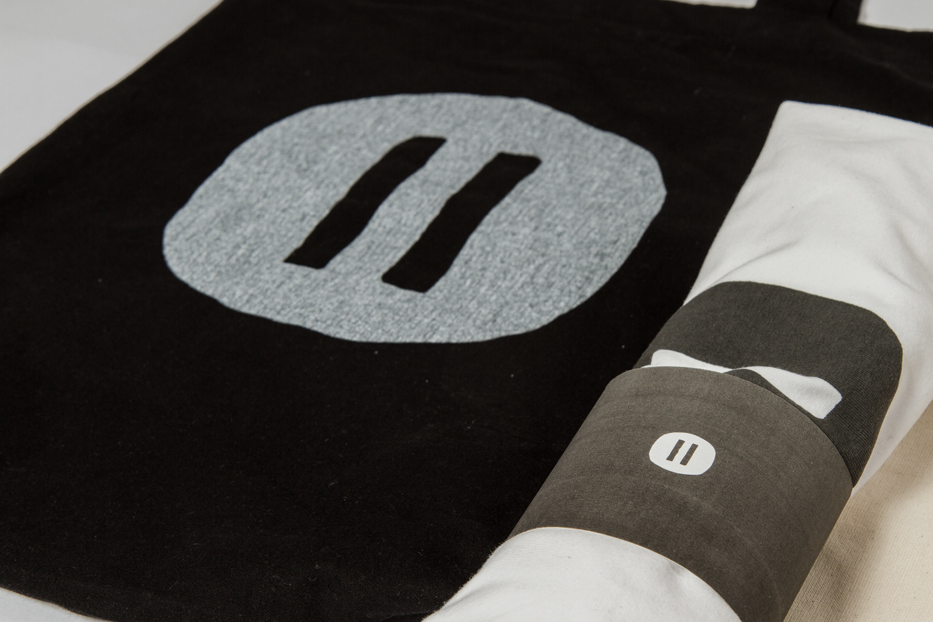
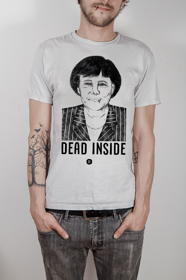
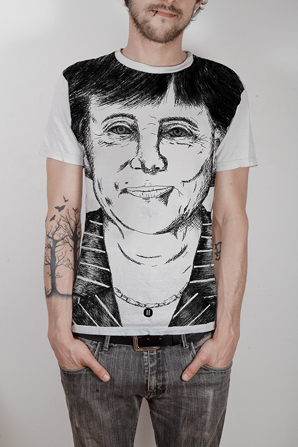
Neben dem Standard-Merchandise des Verlags gibt es für jeden Release eigene Editionen mit einigen Arbeiten aus dem Magazin.
--
MERCHANDISE
Next to the standard merchandise from the label, there is going to be special editions featuring some of the artworks for every release.